Overview
Business cards are Vistaprint’s $300M flagship product category. A four-way test on Vistaprint’s updated business cards category page revealed a significant increase in conversion, but a significant decrease in bookings. Customers were choosing lower priced product options. This shift in behavior had a potential revenue impact of -$8M. We needed to drive the take rate of our premium product options.
Created with: HTML, Sass, React
Background
Vistaprint is a global e-commerce company that provides a range of digital and print services. Customers are primarily small businesses.
- 6,500 employees worldwide
- $1.5 billion annual revenue
- 17 million customers
- 22 localized websites with 700,000 daily unique visitors
Team and role
I reported into the engineering organization and sat on the Site Experience Team of 25 software engineers. We were organized into cross-functional squads. Each squad had two back-end engineers, one front-end engineer (me!), one designer, one product owner, and one analyst.
I was also deeply involved in the Vistaprint community: I held leadership roles in multiple employee resource groups, helped establish the front-end development center of excellence, and was invited to join the customer experience design community.
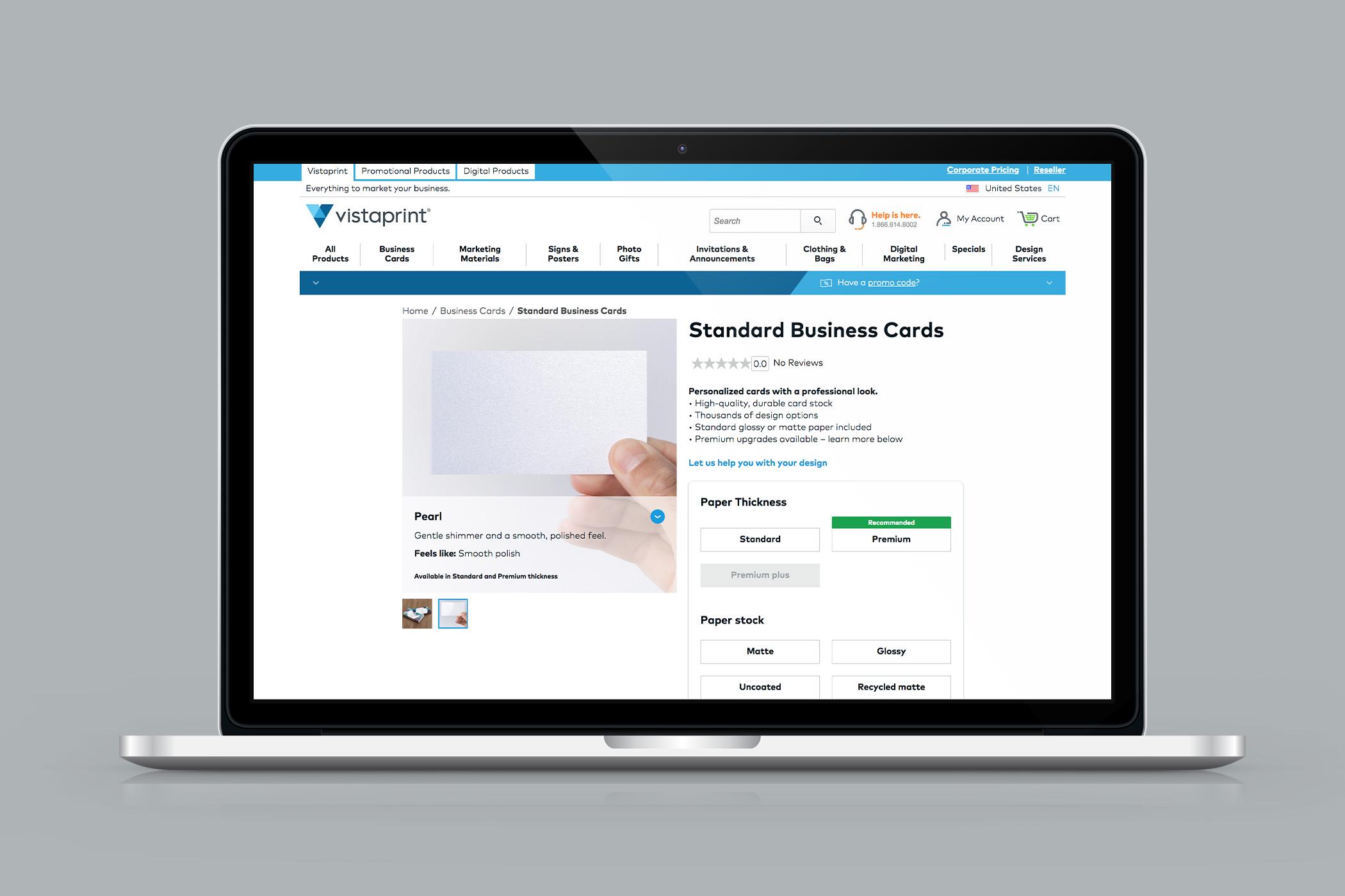
Product configuration
We started with a series of micro experiments on the product page. The existing product configurator experience was confusing and frustrating. We identified three UX pain points that we wanted to address:
- The customer had to make too many choices before they could start designing their business card,
- The styling of incompatible options made customers feel like they weren’t allowed to interact with them, and
- When customers did try to select incompatible options, they encountered confusing and frustrating error messages.
I was the primary developer for our product page enhancements and worked closely with the designer.
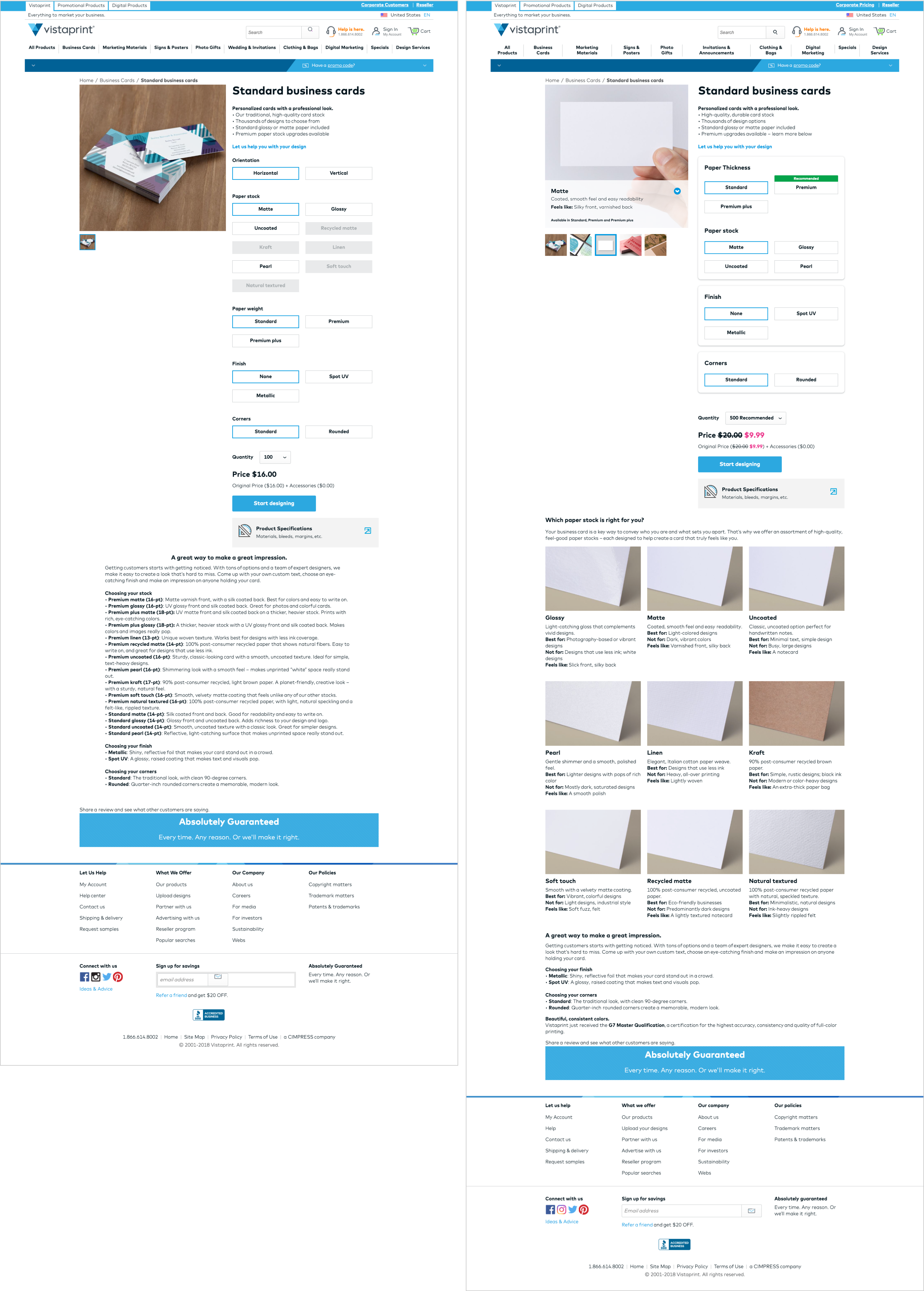
Increment one reduced the number of choices customers needed to make before converting, helped customers understand how their choice of paper thickness impacted their options for paper stock, and encouraged customers to select a premium option.
Increment two removed incompatible options between paper thickness and paper stock, reducing confusion and frustration around incompatible options and errors during product configuration.
Increment three gave customers a more accurate product preview based on their selected options along with more information about the way the paper stock feels to help inform their decision-making process.
We redirected 50% of the traffic and conducted A/B testing. After seeing positive results, I contributed our component enhancements back to the UI Library.
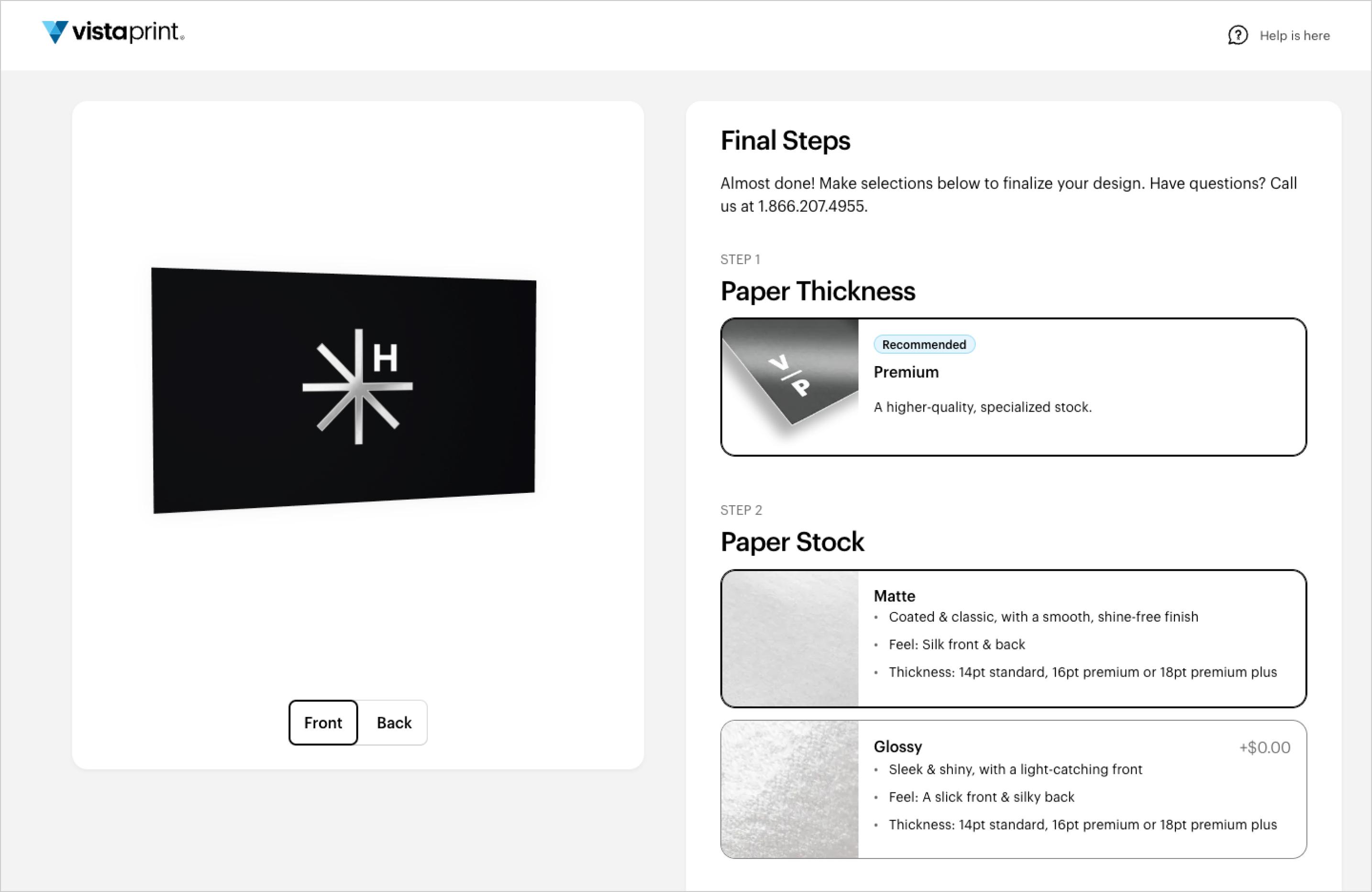
Product previews
Increment four focused on the post-design phase of the flow. The existing 2D product previews didn’t do justice to premium product options like metallic finishes and premium paper thickness.
We integrated homegrown 3D rendering technology into the product review step right before checkout. The rendering gave customers a more realistic preview, allowing them to see how their finished design and selected options came together. They could modify their selected options and see their changes reflected in the product preview. Customers could also flip and rotate the rendering, helping them to better visualize premium options.
Impact and results
Updating the business cards flow was the company’s top UX priority. We launched 4 increments in 1 month and delivered a more profitable flow by improving the user experience, encouraging customers to select premium options, and introducing ways for customers to upgrade throughout the flow.