Overview
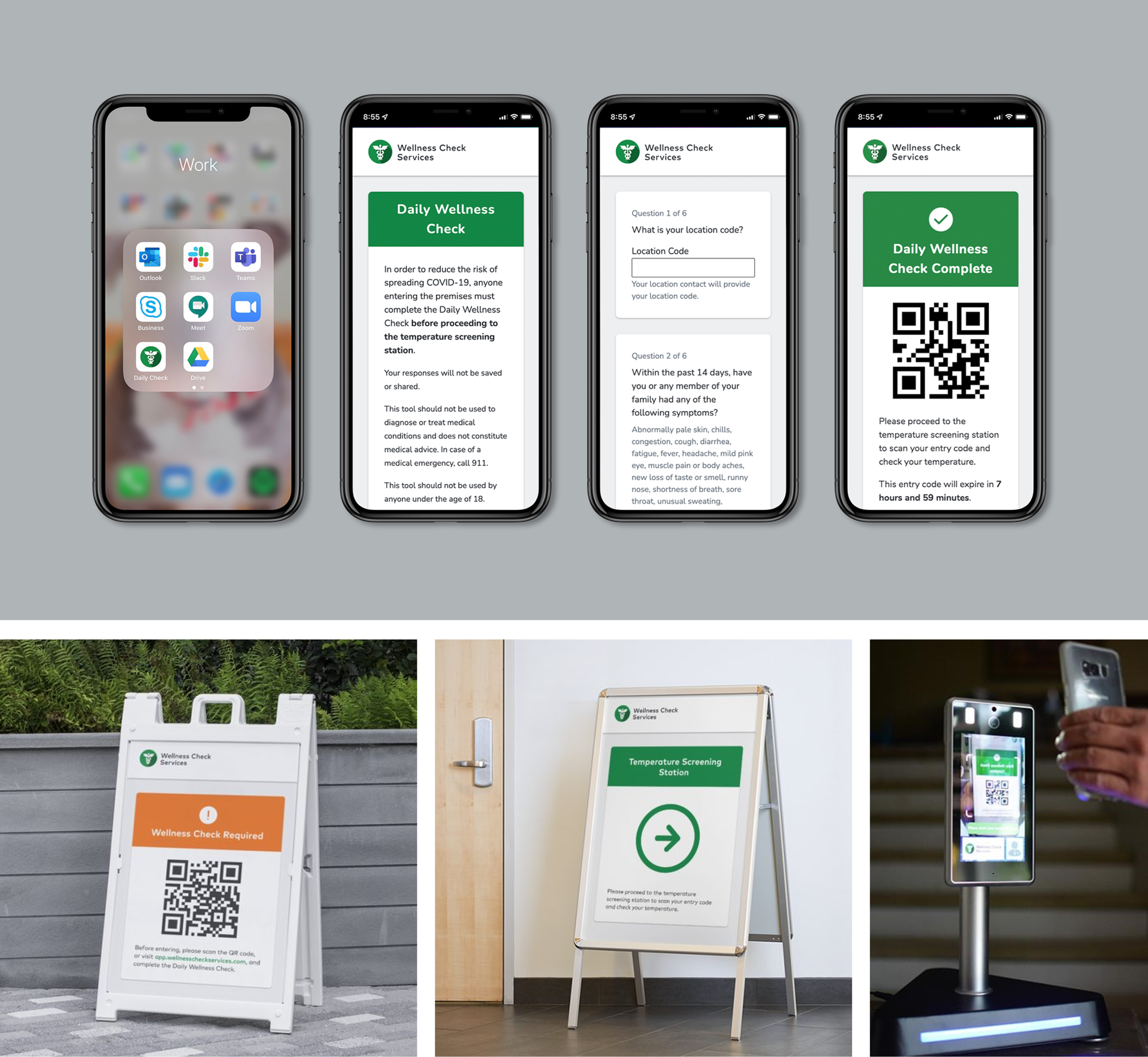
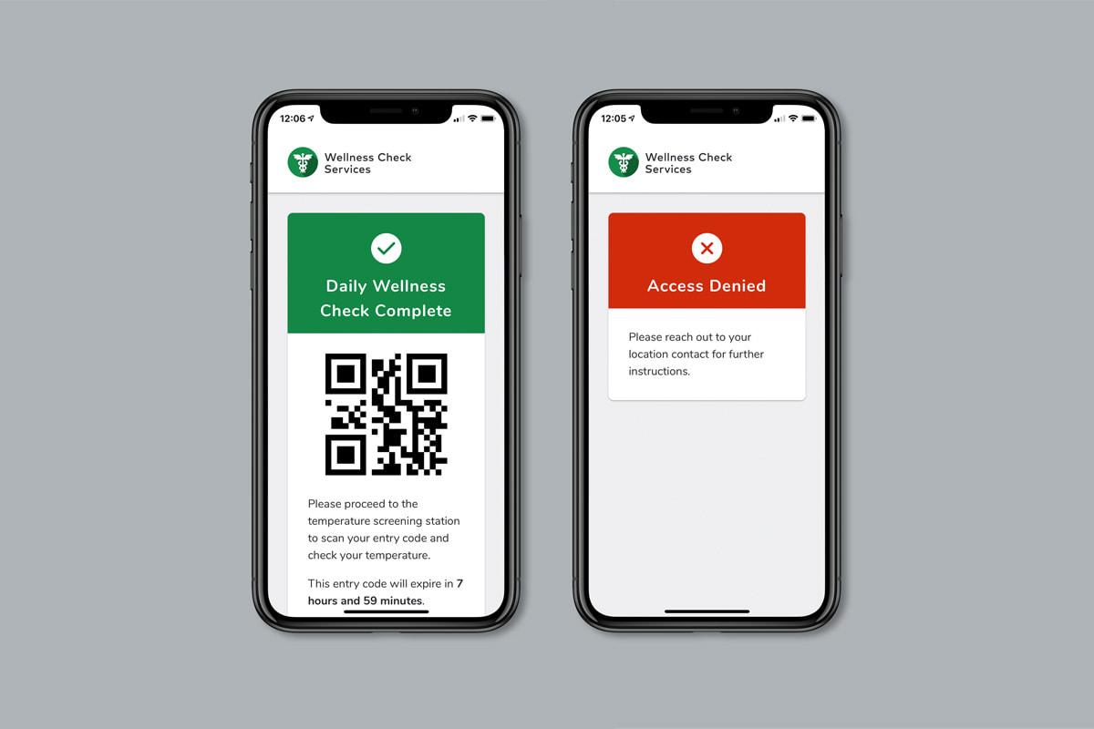
Daily Wellness Check is a COVID-19 screening web app. It serves as the first step in Wellness Check Services’ proprietary physical assessment screening system and integrates with on-site temperature screening devices.
Created with: Illustrator, InDesign, HTML, CSS, JavaScript, Webpack, Babel, Node.js, Netlify Functions, MongoDB Atlas, and Sendgrid
Background
Wellness Check Services (WCS) is a medical technology company that provides wellness screening services.
Team and role
WCS hired me to design and build the Daily Wellness Checks web app. I hand-picked a team of trusted former colleagues and friends to help me deliver it. The team consisted of 1 unicorn (me!), 2 back-end developers, and 1 copy editor.
My responsibilities included:
- Product design (UX/UI)
- Front-end development
- Client and project management
- Branding
- UX copywriting
- Graphic design
Discovery
I started by meeting with the client to learn more about their customers and the app’s users. The client expected commercial property management companies to be their primary customers, and office employees to be the app’s primary daily users. Occasional users could include guests and delivery people.
The app needed to support multiple customers with 200 to 2,000 properties per customer and 600 to 800 users per property per day – that comes out to 120,000 to 1,600,000 daily users per customer.
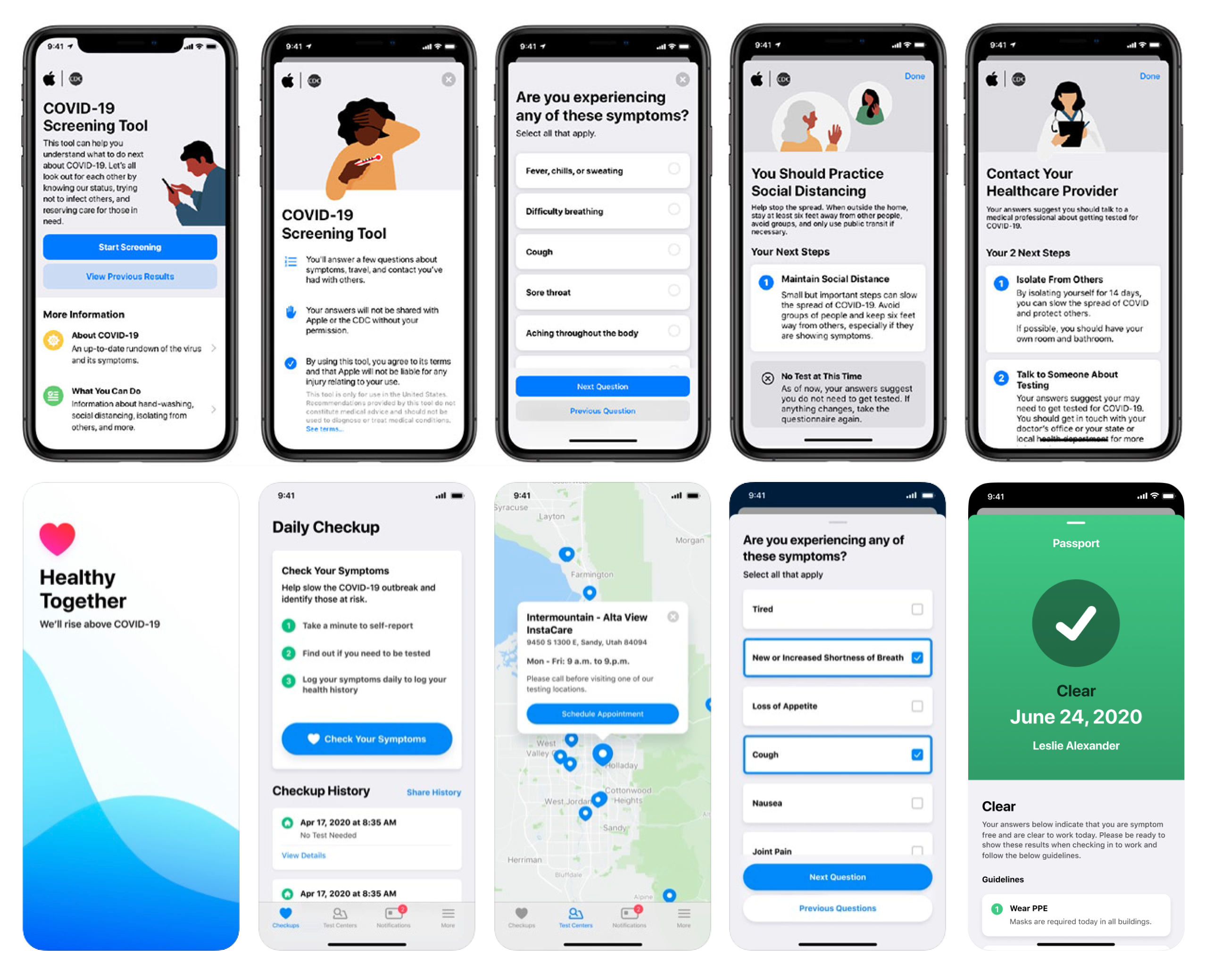
I did some competitive research and explored screening tools and apps from Aduro, Apple, Google, HealthyTogether, Stanford Medicine, UMass Amherst, and UnitedHealth.
My team and I met to talk about the project requirements and brainstorm some solutions that we could deliver within the project timeline. We also had some ideas that fell outside of the project scope, such as translations, custom instances, and mobile wallet integration. I wrote up our proposal, and shared our ideas to consider for future enhancements.
Design
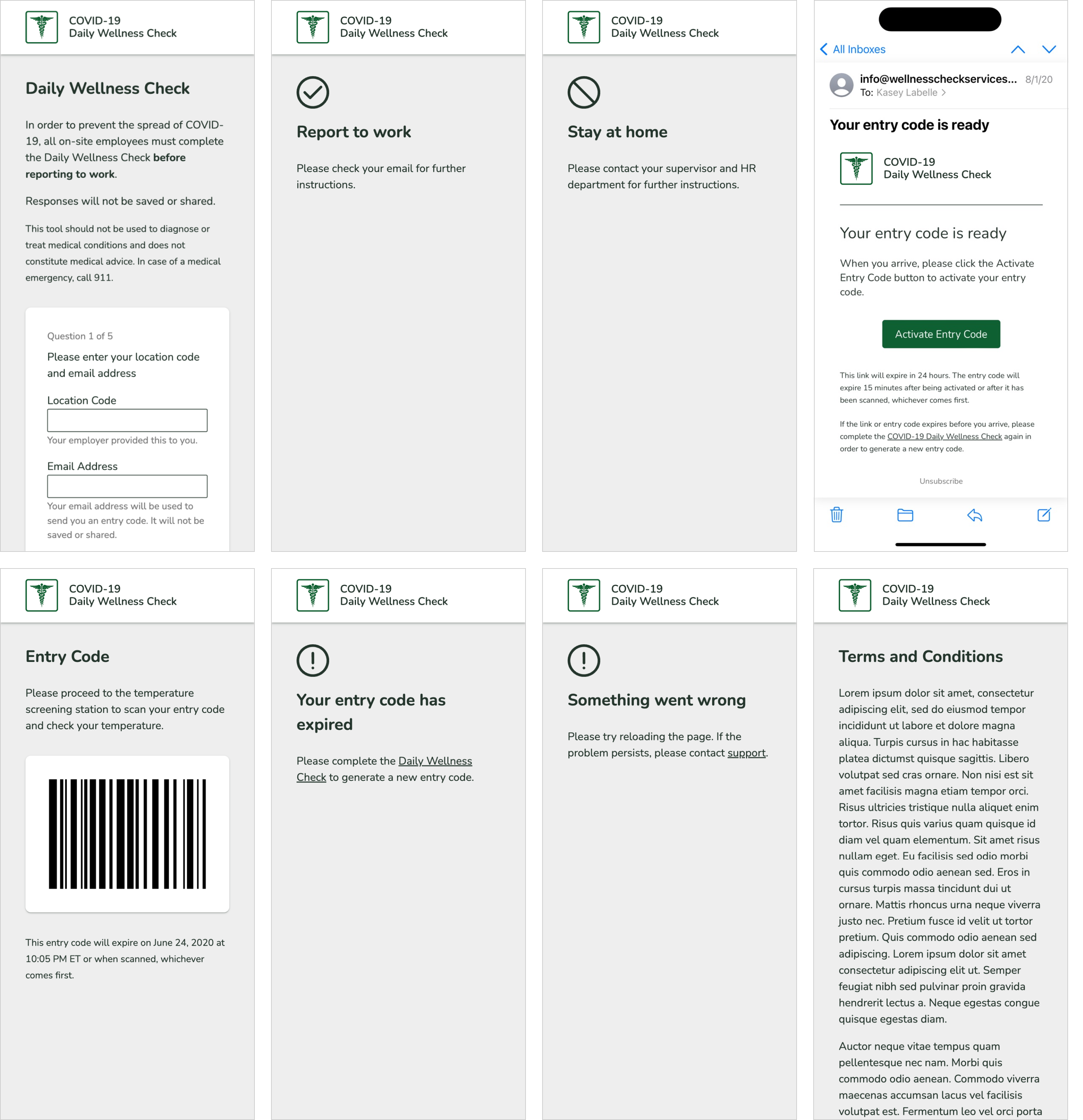
Iteration 1
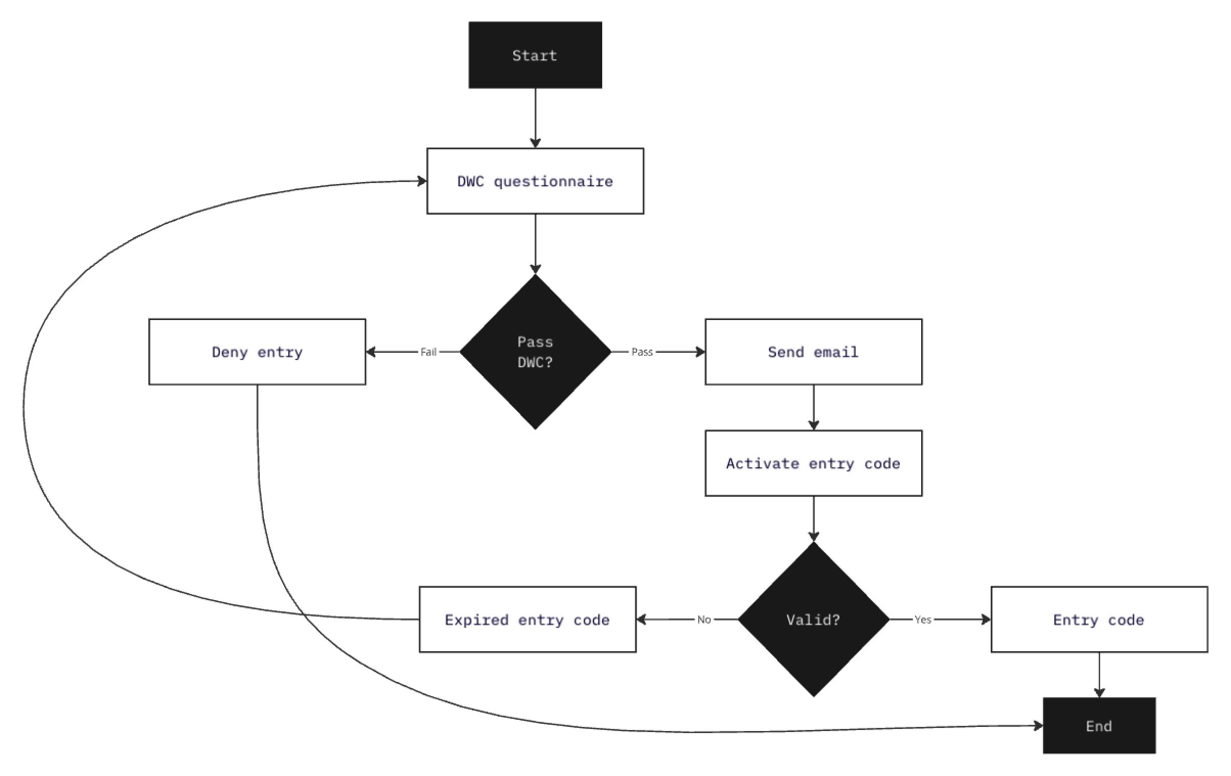
Since I was responsible for product design and front-end development, I created high-fidelity wireframes in code. The wireframes included a placeholder logo, draft copy, and minimal styling. I worked through the user experience of the screening questions, validation patterns, and success and failure scenarios. Then I shared the wireframes with the client for feedback.
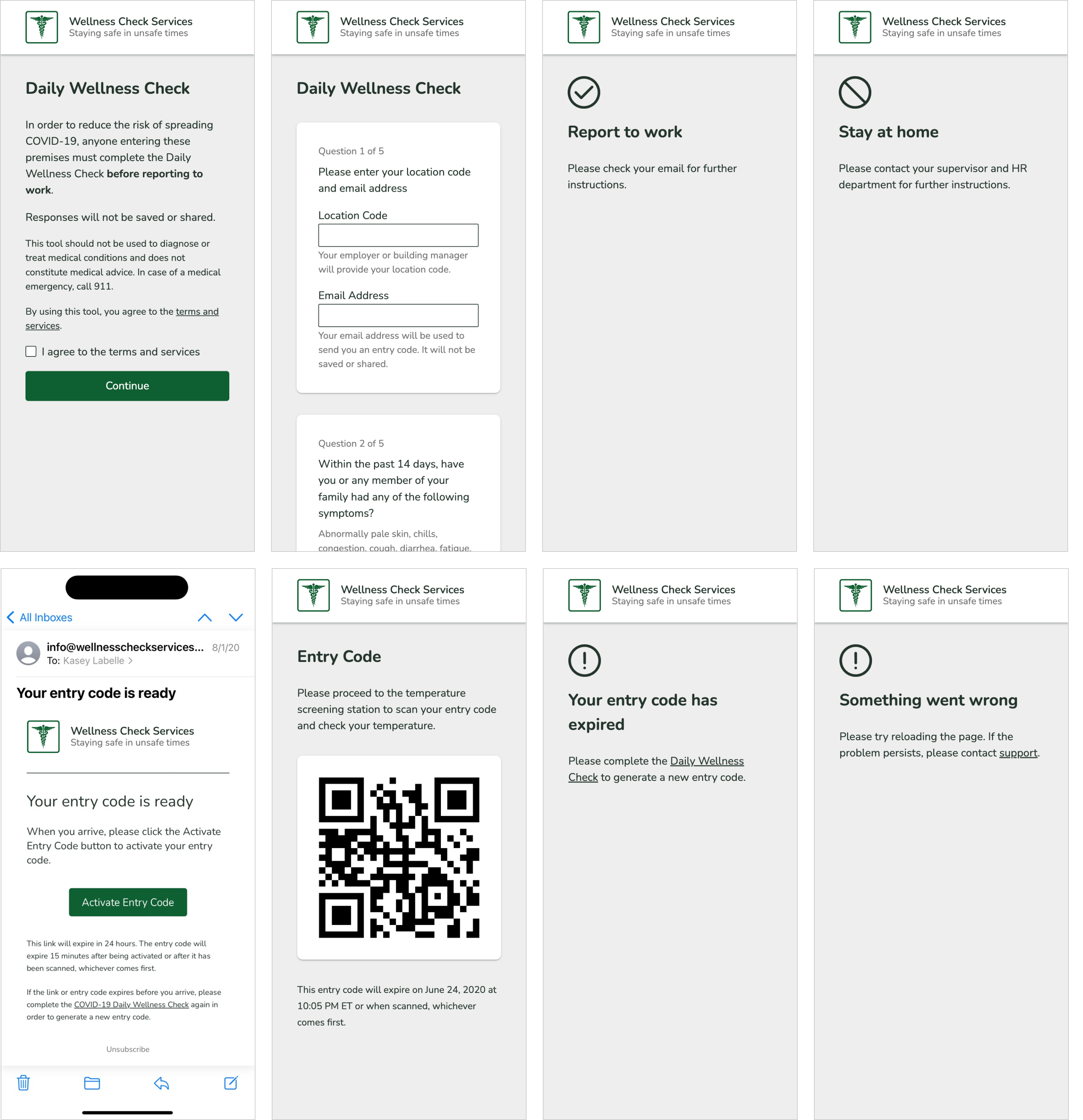
Iteration 2
The client reviewed the wireframes with their legal team to get input on the wording and flow of the app. The attorney shared feedback in the form of a solution instead of a problem: “After the user enters their location code and email, the user will see a modal containing a legal disclaimer and terms. The user must scroll to the bottom and check a checkbox to confirm that they read the content before they can proceed to the screening questions.”
I could only imagine how frustrating that experience would be for daily users, so I proposed an alternate solution: add a screen with the legal disclaimer, a link to the terms, and a consent checkbox before the screening questions.
Branding
In between iterations 2 and 3, the client expanded the project scope to include company branding.
The business partners had differing opinions on the creative direction, so I revisited my market research. Their competitors’ brands were modern and minimal and felt simple-but-high-end. They used crisp text and bright colors, and had similar-but-different applications of their logos based on the context. The clients agreed to shift the direction from “traditional, conservative, professional, functional” to “modern, simple.”
The client had 2 requirements for the logo: it needed to incorporate the Caduceus and the green from the sister company’s color palette. They planned to use the logo on the daily wellness check app and the company’s marketing materials. I explored a few solutions that met the requirements and followed best practices for logo design.
I presented my recommendation to the client and included mockups to show how the logo would work in various contexts like the company’s letterhead, uniforms, and social media profiles.
I developed a mini brand guide for the client’s marketing agency to use when creating company-branded materials. I also designed an icon set for use in the app, and wayfinding signage to connect the digital and physical experience.
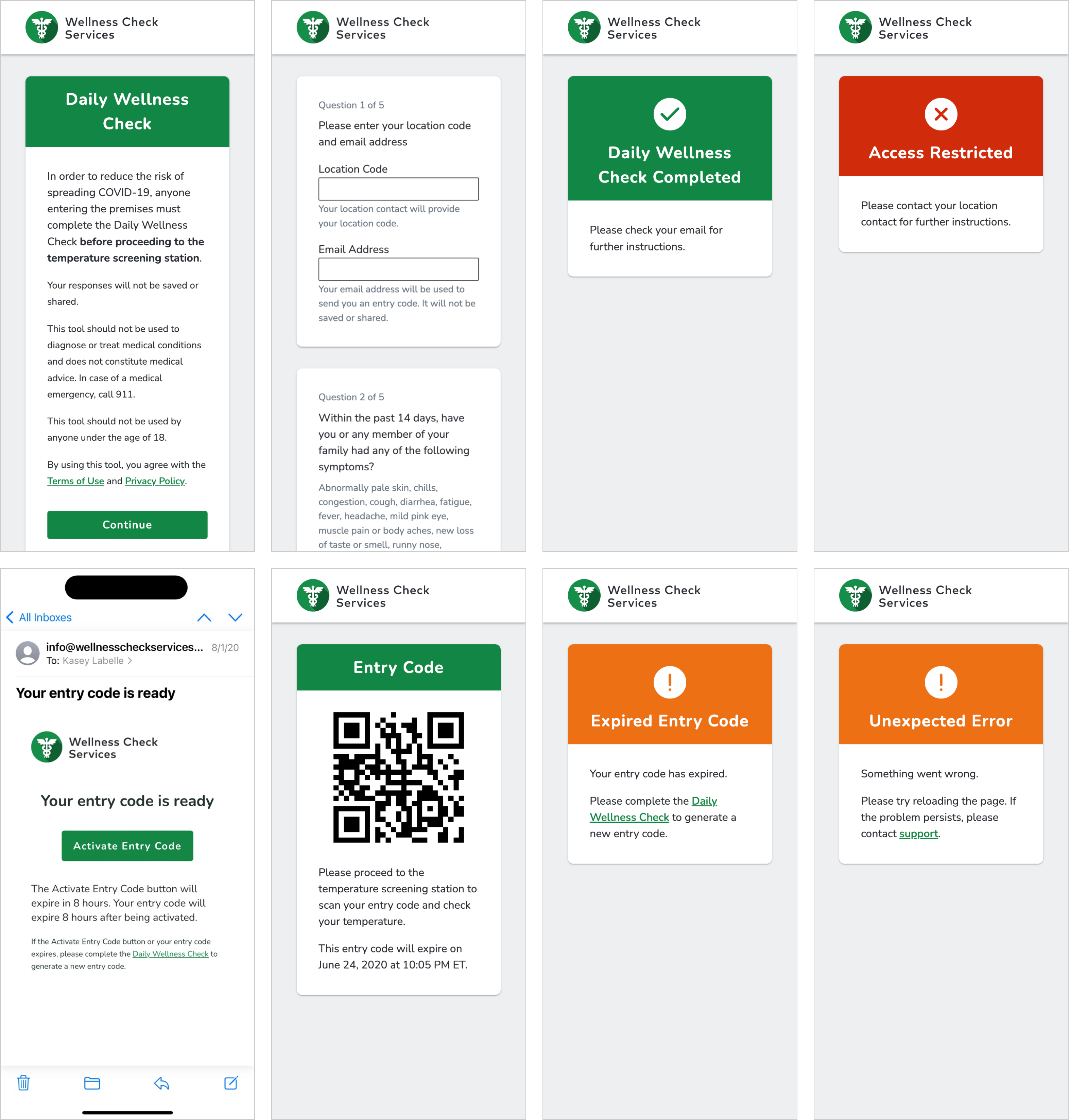
Iteration 3
Once the branding was done, I started the UI design. My goals were to make the app feel lighter, brighter, and … “app-ier.” I updated the logo and favicon, added cards, designed an elevation system, and applied color meaningfully while ensuring sufficient contrast. The changes were relatively minor, but they made a big difference.
The third iteration also included copy updates and UX improvements, like replacing the consent checkbox with a statement to reduce the number of clicks needed to complete the daily wellness check.
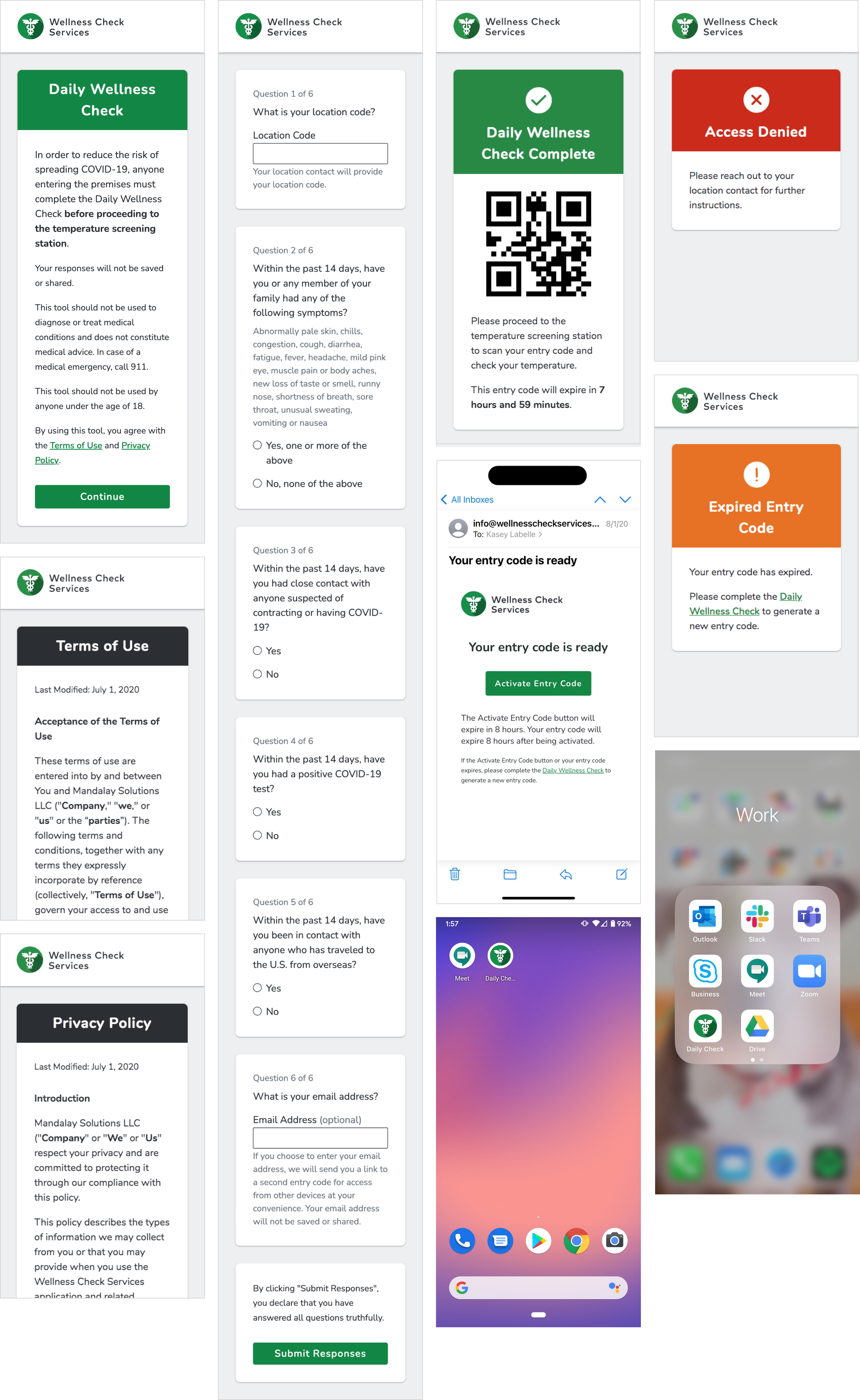
Iteration 4
The clients received two pieces of feedback that we addressed in the fourth and final iteration: increase the font size and make the email address entry optional.
Since I followed best practices for responsive web development and accessibility when I built the front-end, increasing the font size was super easy. I simply adjusted the base font size, and everything else scaled proportionally.
Making the email address entry optional required more significant changes to the flow, but it came with benefits for both daily and occasional users.
UX copywriting
The app’s copy came from a few sources: me, the client, the client’s legal team, the CDC, and the copy editor. Some of the proposed copy was lengthy and written at a post-grad reading level, with a less than friendly tone.
I wanted to ensure users felt informed and supported, rather than feeling like they did something bad or wrong by answering the screening questions honestly. The copy needed to be clear and concise, and the voice and tone needed to be conversational and professional.
After the final iteration, I suggested bringing in a copy editor for one hour to advise on how to best tweak some copy and help text to prevent two potentially frustrating scenarios.
Development
Designing in code gave me a big head start on front-end development. I used semantic markup, ARIA attributes, and CSS custom properties to ensure accessibility and flexibility from the very beginning. After the third design iteration, I only needed to add a loading state for the entry code and make a few minor adjustments for the updated flow.
The back-end developers had been working in parallel. They architected and built the backend, and integrated the app with the on-site temperature screening hardware. The app was built using a JAMStack architecture backed by Netlify serverless functions. We serve pre-rendered pages through Netlify’s Edge Delivery Network. The architecture was designed with speed, redundancy, and scalability at its core.
We chose SaaS providers that offered free tiers with industry-leading service-level agreements as well as paid tiers and services. This reduced short-term costs and planned for long-term growth, allowing WCS to expand and scale without the tech holding them back.
Impact and results
This project had lots of moving parts and parallel work, but it all came together super smoothly. Every screen achieved perfect scores across all categories when running Lighthouse audits for performance, accessibility, best practices, SEO, and Progressive Web App compliance. Users can complete the daily wellness check in as few as 7 clicks. Customers can process more wellness checks in less time and at a lower cost – 500 people per unit compared to 125 people per attendant, resulting in a 400% time savings.