Overview
Anatomy is Boston Scientific’s first global design system. The system needed to improve consistency, usability, and accessibility across our products, while also reducing costs. The team needed to launch an MVP in 90 days, reach maturity in 2 years, and demonstrate value along the way.
Created with: Sketch, Figma, HTML, CSS, Sass, React, TypeScript, Style Dictionary, Storybook, Chromatic, Markdown, GraphQL, Contentful, Netlify
Background
Boston Scientific is a global medical technology company and device manufacturer. Customers include healthcare professionals, patients and caregivers, and investors.
- 48,000 employees worldwide who are organized into 8 business units
- $14.2 billion annual revenue
- 37 million patients treated annually
- 15,000 products
Team and role
I led the multi-disciplinary design system product team that designed, built, and maintained Anatomy. The core team consisted of two UX developers and one UX designer, augmented by a number of full-time, part-time, and project-based contractors, as well as community contributions, to accelerate delivery.
My role evolved over the years. I joined Boston Scientific as the first (read: only) member of the Anatomy team. I was quickly promoted from lead individual contributor into management and continued to scale the team. Ultimately, I acted as a manager, lead individual contributor, accessibility specialist, and product owner.
Discovery
We conducted audits, stakeholder interviews, and workshops to get a sense of where we were. We learned that product teams were doing the same thing just a little bit differently in so many places, resulting in a fragmented experience and an expensive and inefficient process.
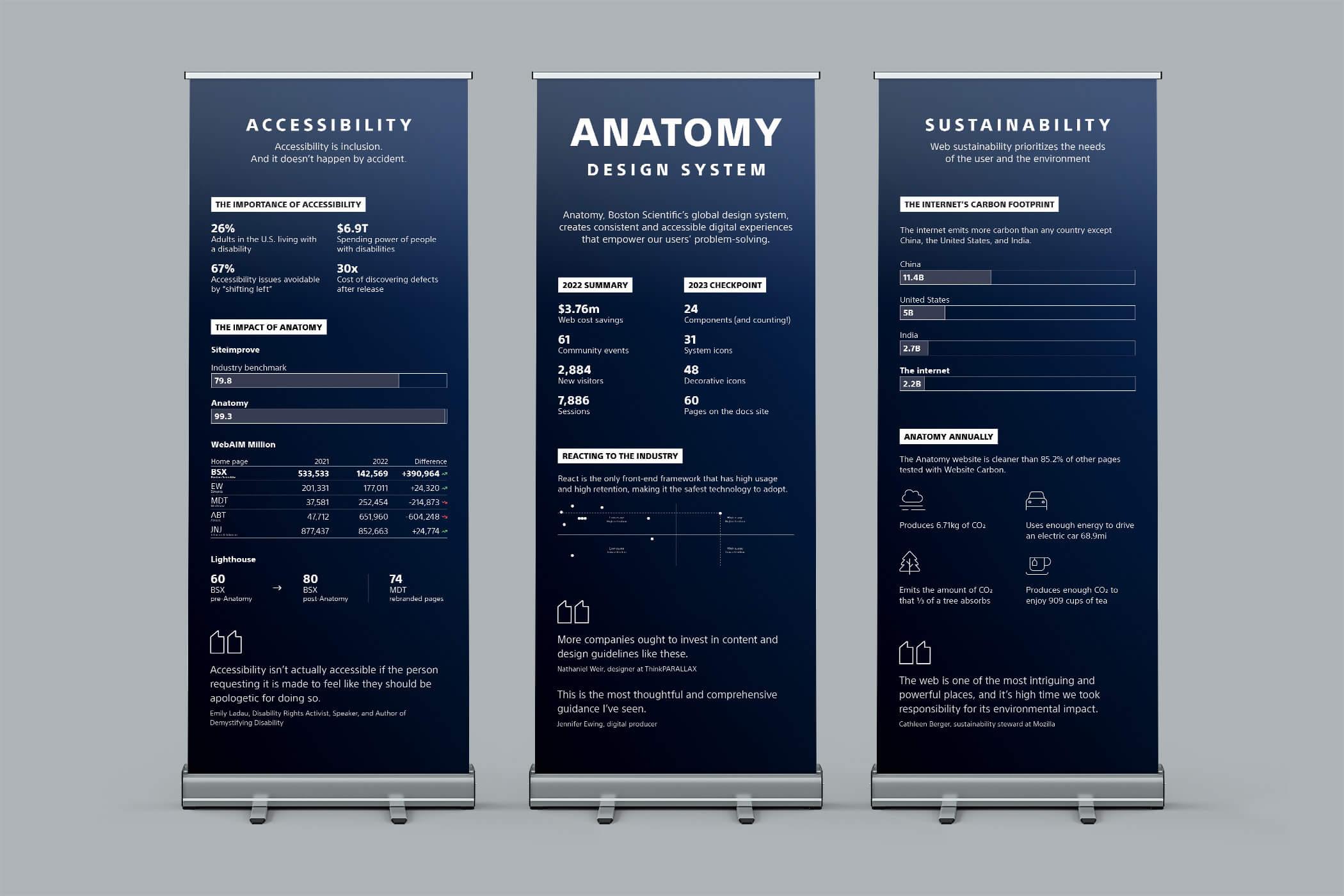
We uncovered 9 product-specific style guides, and learned that roughly every design tool, front-end framework, enterprise platform, and content management system was in use across our products. We identified our north stars and researched industry standards and best practices to get a sense of where we wanted to be.
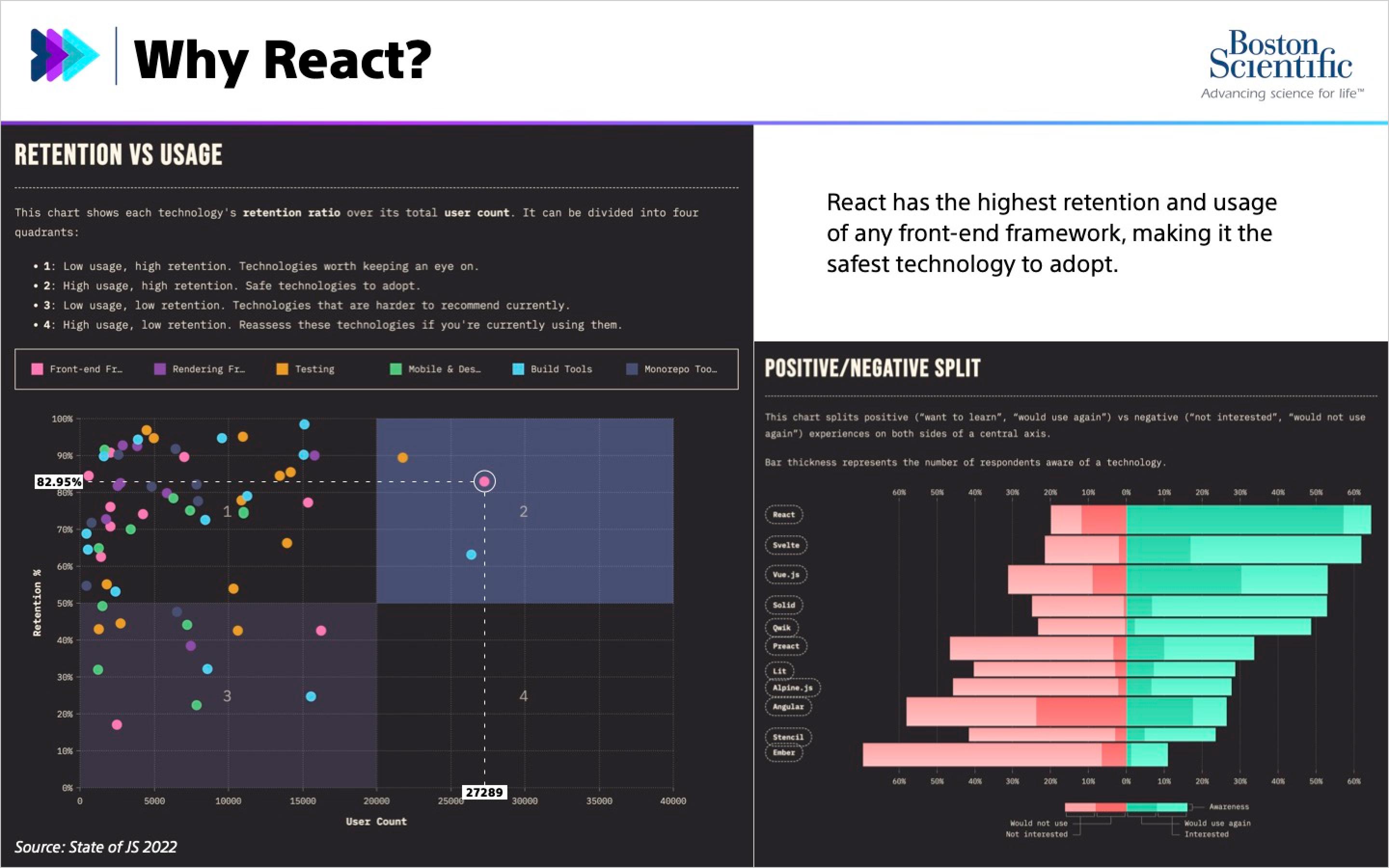
I leveraged industry surveys to assess front-end frameworks for usage, retention, and interest to inform the tech stack for our design system offerings. React had the highest ratings, it was the primary framework used by all of our north stars, and it was compatible with the tech stacks used in our highest priority products. This made it the safest framework to adopt for the initial build of our component library and custom documentation site.
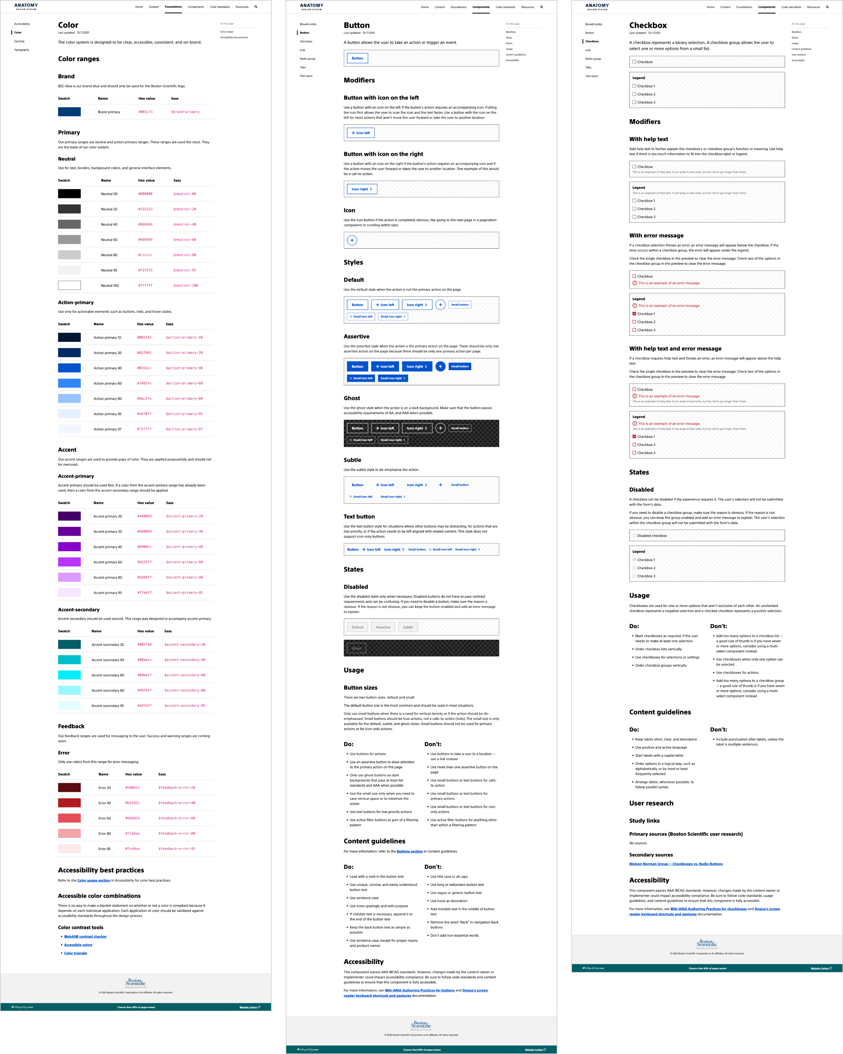
Defining design foundations
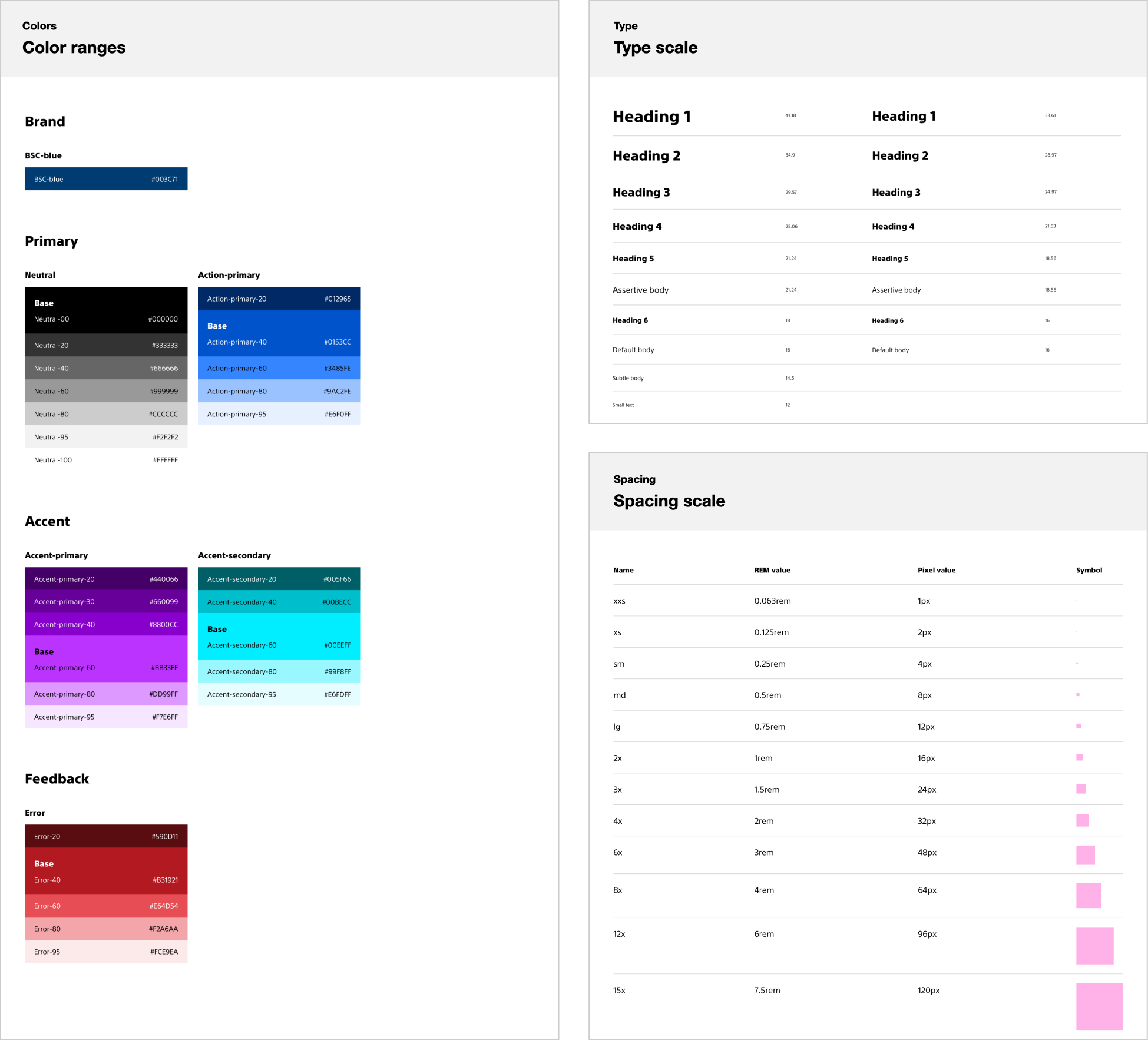
I partnered with the UX designer to define Anatomy’s design foundations. They needed to be flexible and scalable to allow Anatomy to evolve and expand over time. To achieve this, I advocated for abstracted color, type, and spacing scales.
Our abstracted color ranges ensured a consistent and meaningful application of color across our design system and products, and our type and spacing scales helped maintain relative hierarchy and vertical rhythm regardless of viewport size or zoom level. I developed guidelines on how to apply space to elements: almost always to the top to give us more control over how elements stack.
Launching MVP
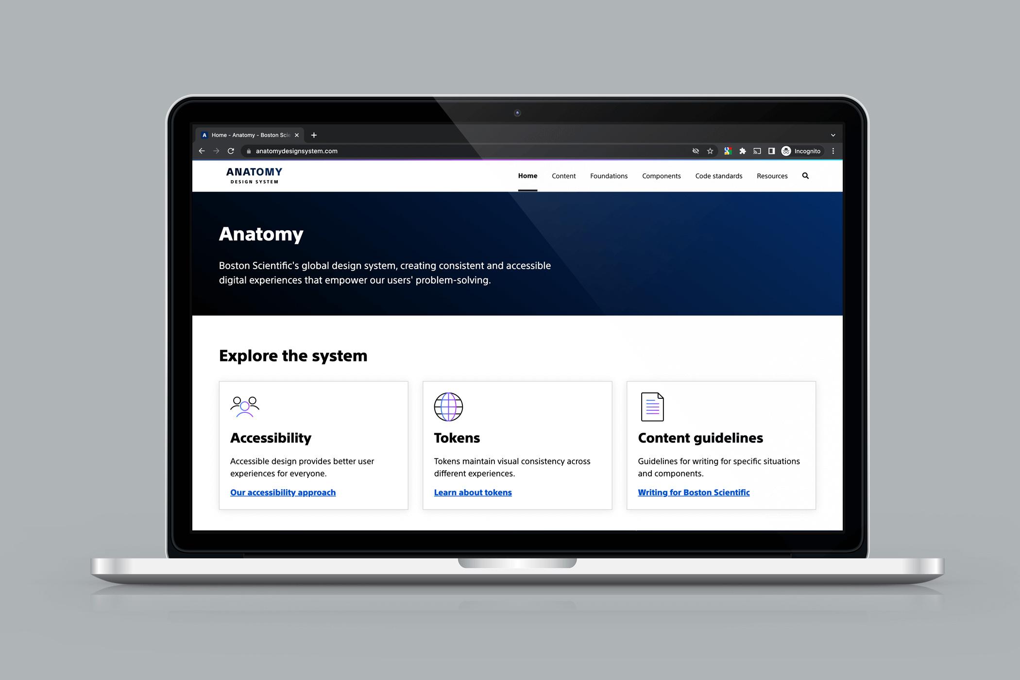
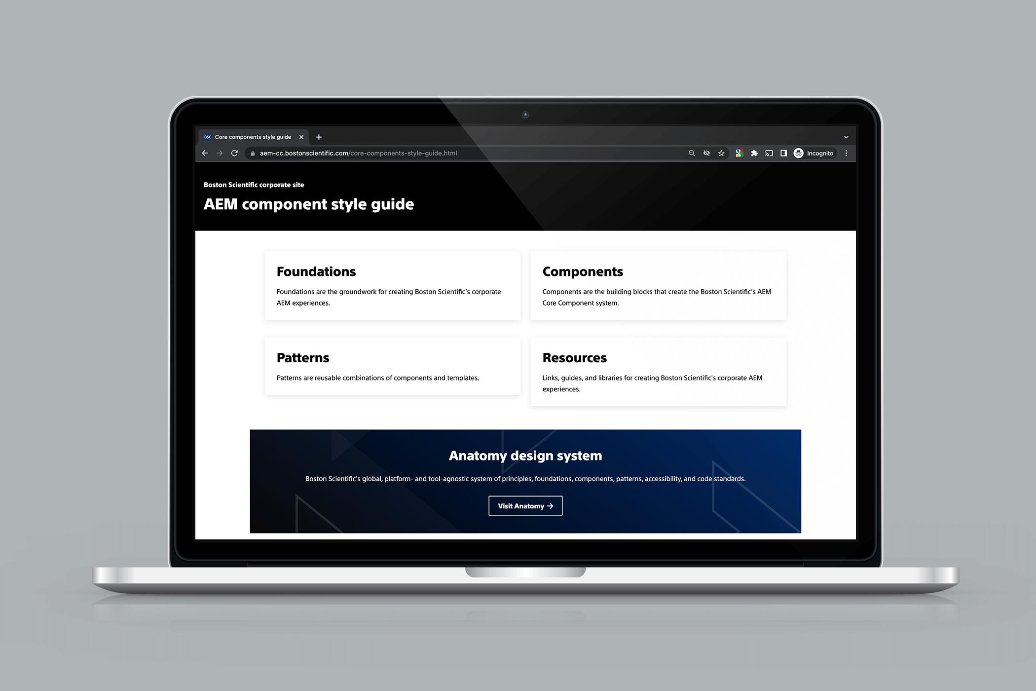
In just 90 days, we launched our MVP. Our documentation site served as a centralized source of truth for content guidelines, design foundations (color, type, spacing, accessibility), components and usage guidelines, and role-based resources like Sketch libraries and code standards.
We also created a playbook and held product launch roadshows. I developed product-specific technical strategy and integration plans to help teams understand how they could leverage Anatomy.
Making short-term progress towards long-term goals
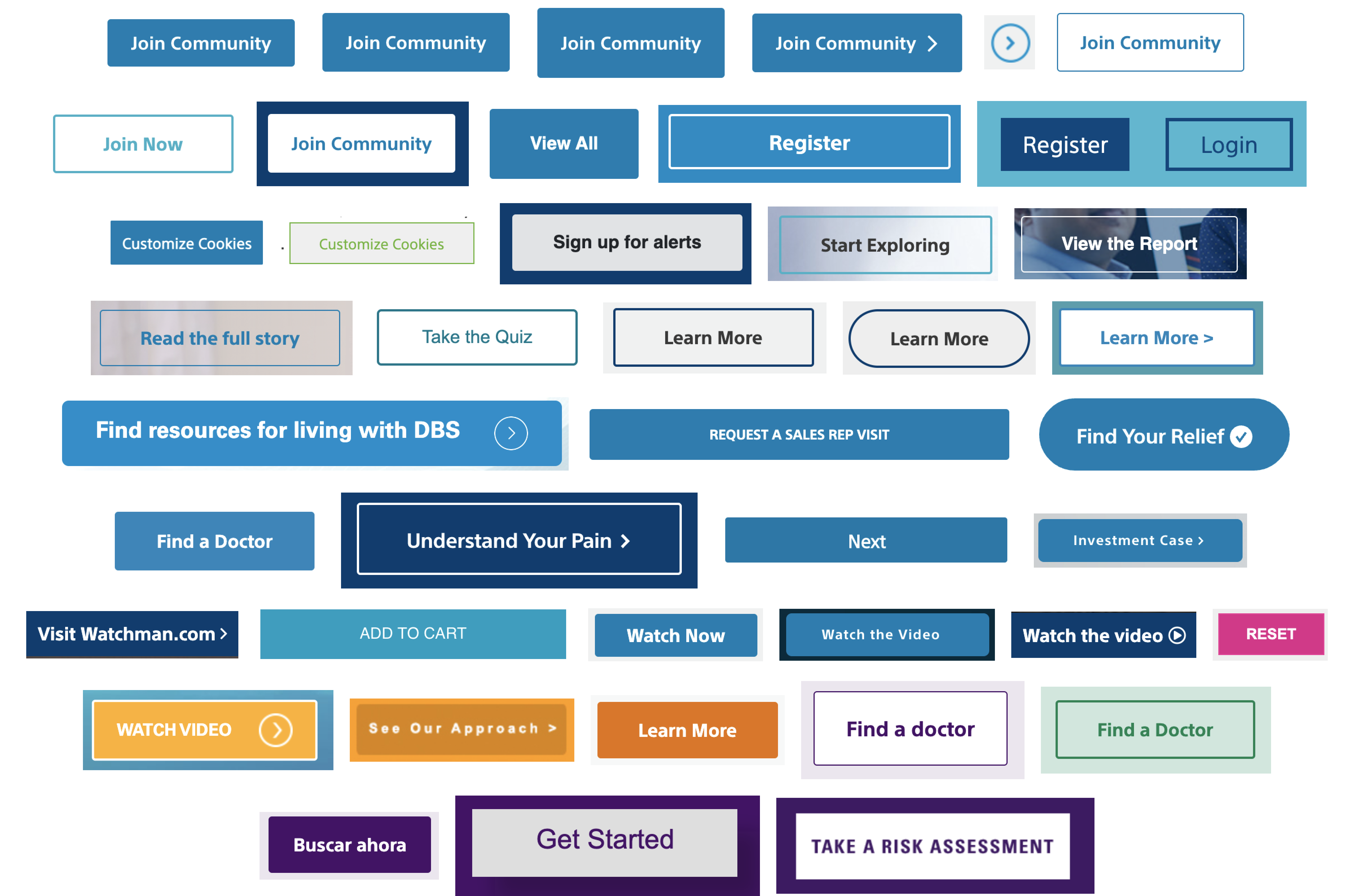
The team was just getting started on our component library, but we needed to quickly demonstrate value while simultaneously working towards long-term goals. We focused on visual alignment and began sharing code by copying snippets from Anatomy into individual products. I have been known to say “if you’re copying and pasting code, you’re doing it wrong” but this approach came with benefits. We made some short-term progress, built relationships (and trust) with product teams, and developed knowledge about downstream products.
As a stop-gap, I developed a style system on top of AEM Core Components. The style system improved the user experience, accessibility, and front-end code quality of our corporate site while we worked on packaging our component library.
Reaching maturity
Demand increased, so we scaled the team. We packaged our design tokens, React component library, and linter configs, we created a Storybook, and we iterated on our documentation site.
In H1 2024, we migrated from Sketch to Figma and added support for themes and modes.
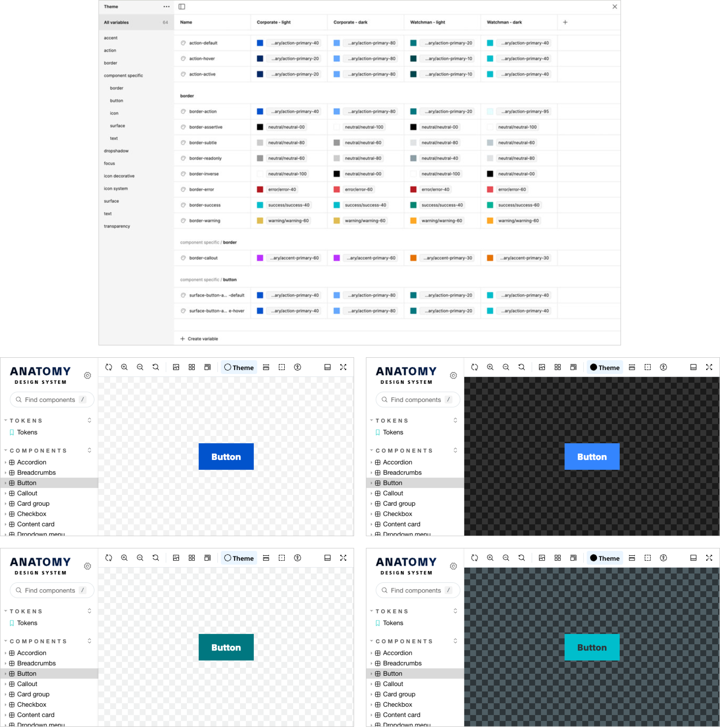
After the Figma migration, we re-architected the system and used the Figma API to automate the publishing of our design tokens from Figma to npm.
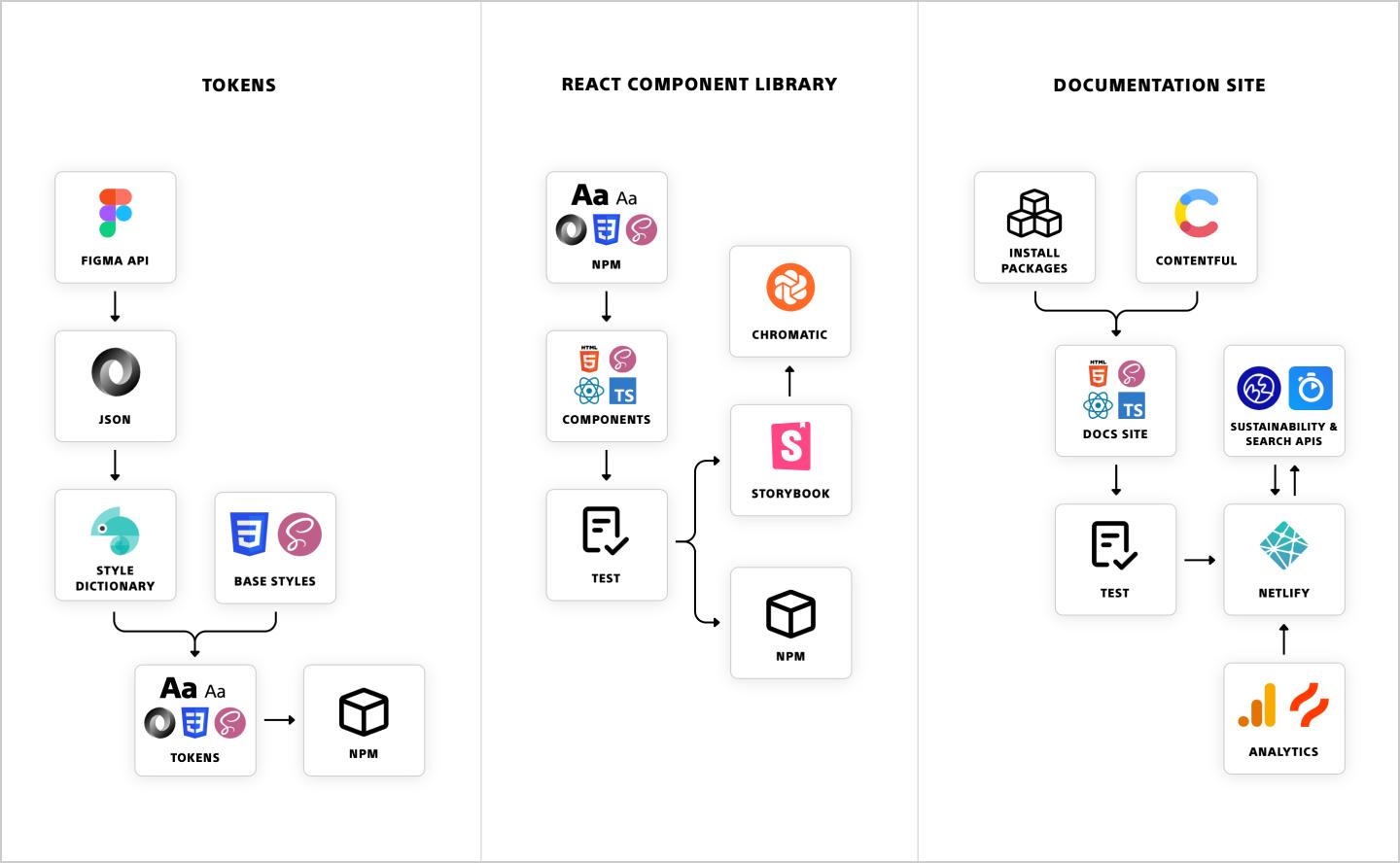
Today, Anatomy’s offerings include:
- 2 themes with light and dark modes
- 10 Figma libraries
- 5 npm packages
- Design tokens with support for CSS, Sass, and JSON
- React component library
- Configs for ESLint, Stylelint, and Prettier
- Component playground, API documentation, and automated visual regression testing via Storybook
- Custom React documentation site powered by Contentful and Netlify
Community
The Anatomy community included roughly 150 internal stakeholders across design, engineering, product, brand, and marketing. The extended community included business units, agency partners, and contractors.
The Anatomy team spent a lot of our early days ensuring the community had a solid understanding of what a design system is, why it’s valuable, and how to leverage Anatomy to create consistent experiences at scale and free up time for new features and innovation.
Over the years, we maintained a number of community touchpoints. We ran Slack and Teams channels, provided onboarding and integration support, organized regular role-based check-ins, held monthly office hours, sent quarterly newsletters, gave presentations, and hosted workshops. I happily put my design background to use by designing the logo and creating banners and QR cards for our workshops.
We also helped product designers and developers leverage Anatomy through co-creation and pair programming sessions, exponentially reducing duplicative work. Some teams simply applied our design foundations while others used our design libraries, installed our npm packages, and proposed enhancements.
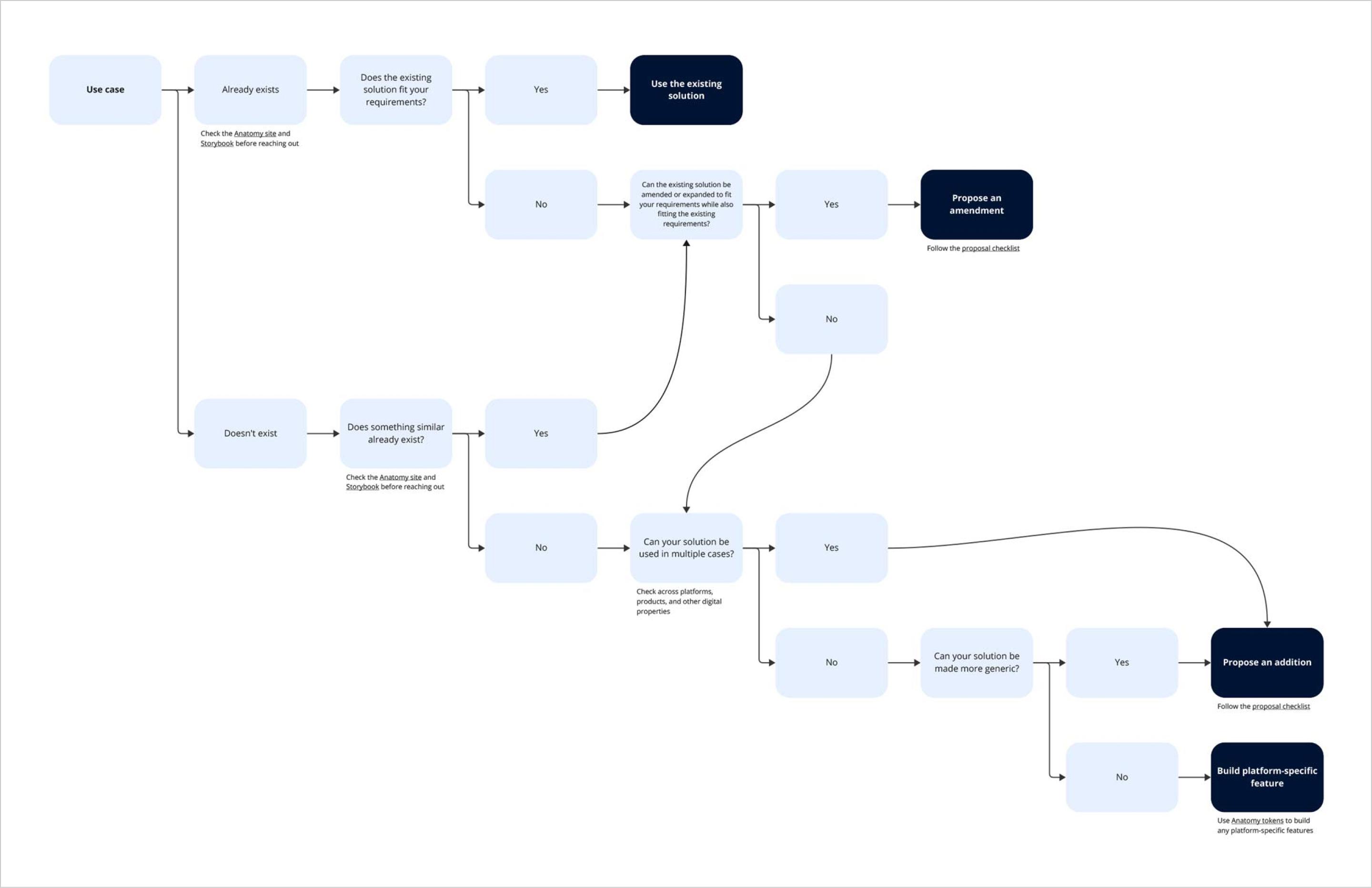
As the community and design system matured, we developed a governance model, contribution guidelines, and an intake process.
Measuring success
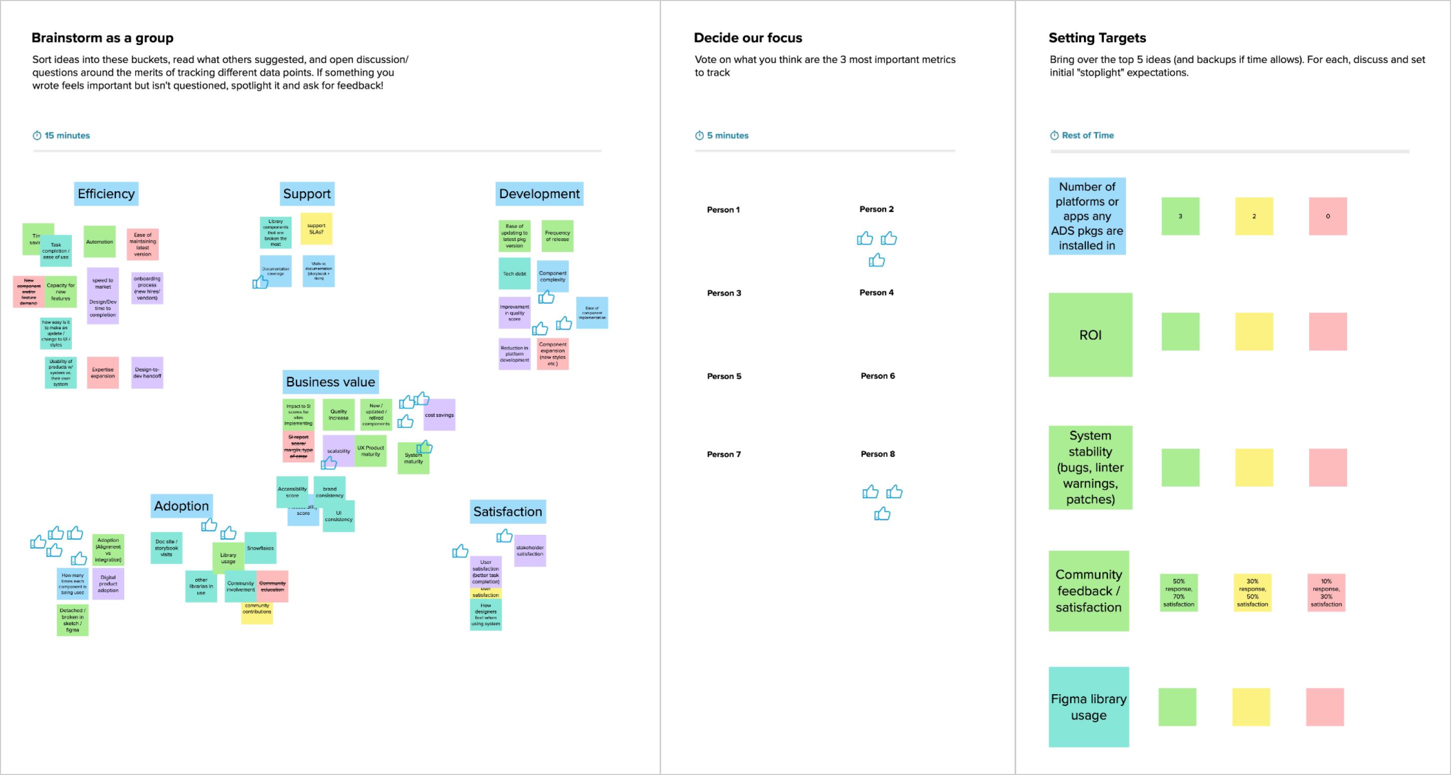
In our early phases, our goals included tracking design library downloads and shipping an arbitrary number of components per year. These quantity-based metrics ceased to capture the value of Anatomy as the product, team, and community matured.
I researched design system metrics to learn how other companies measured the success of their design systems and set up a brainstorming session with the team. We decided to measure adoption across design and development, community engagement and satisfaction, and ROI. I used these decisions to develop our annual and quarterly plans, product roadmap, and goals.
Impact and results
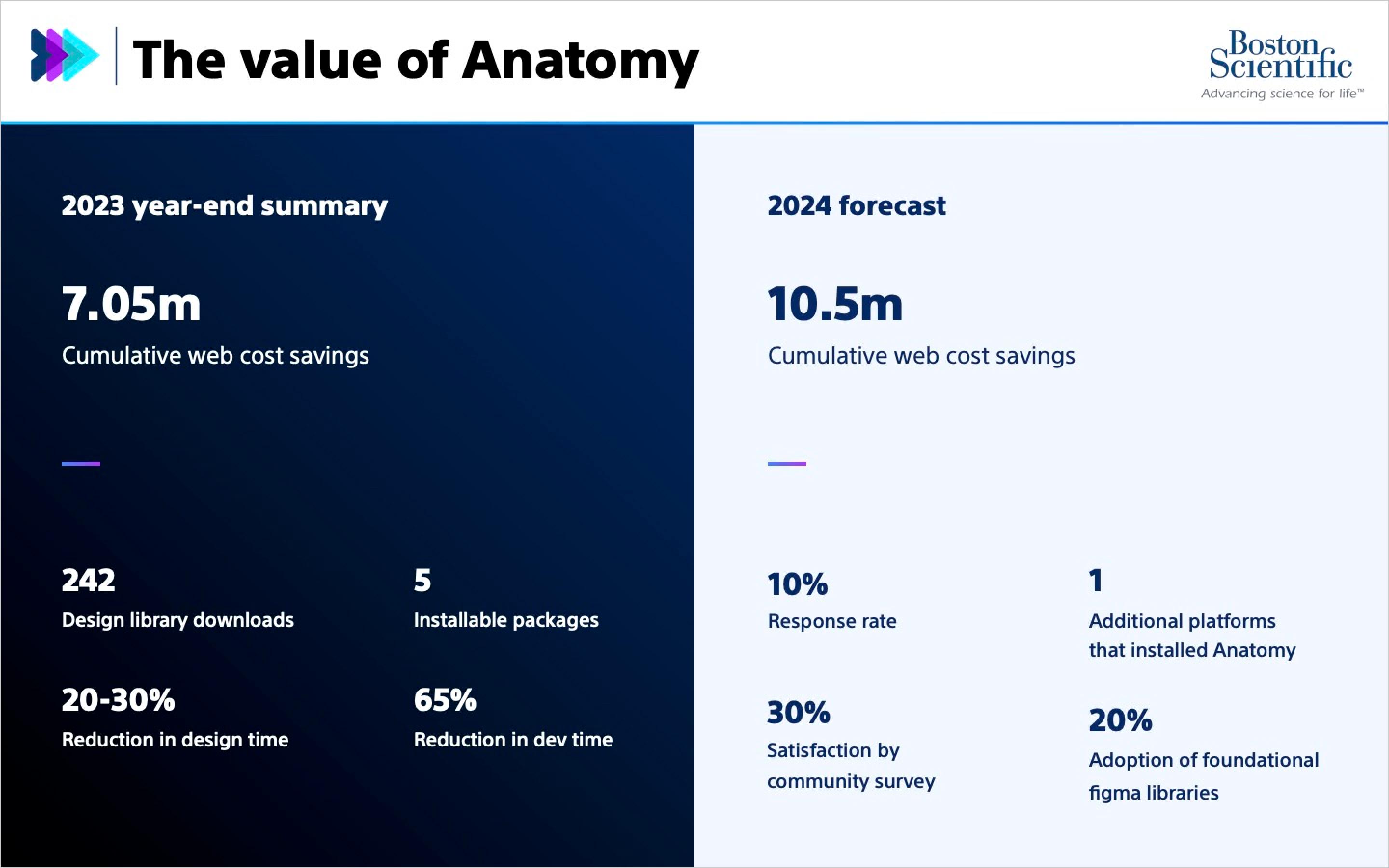
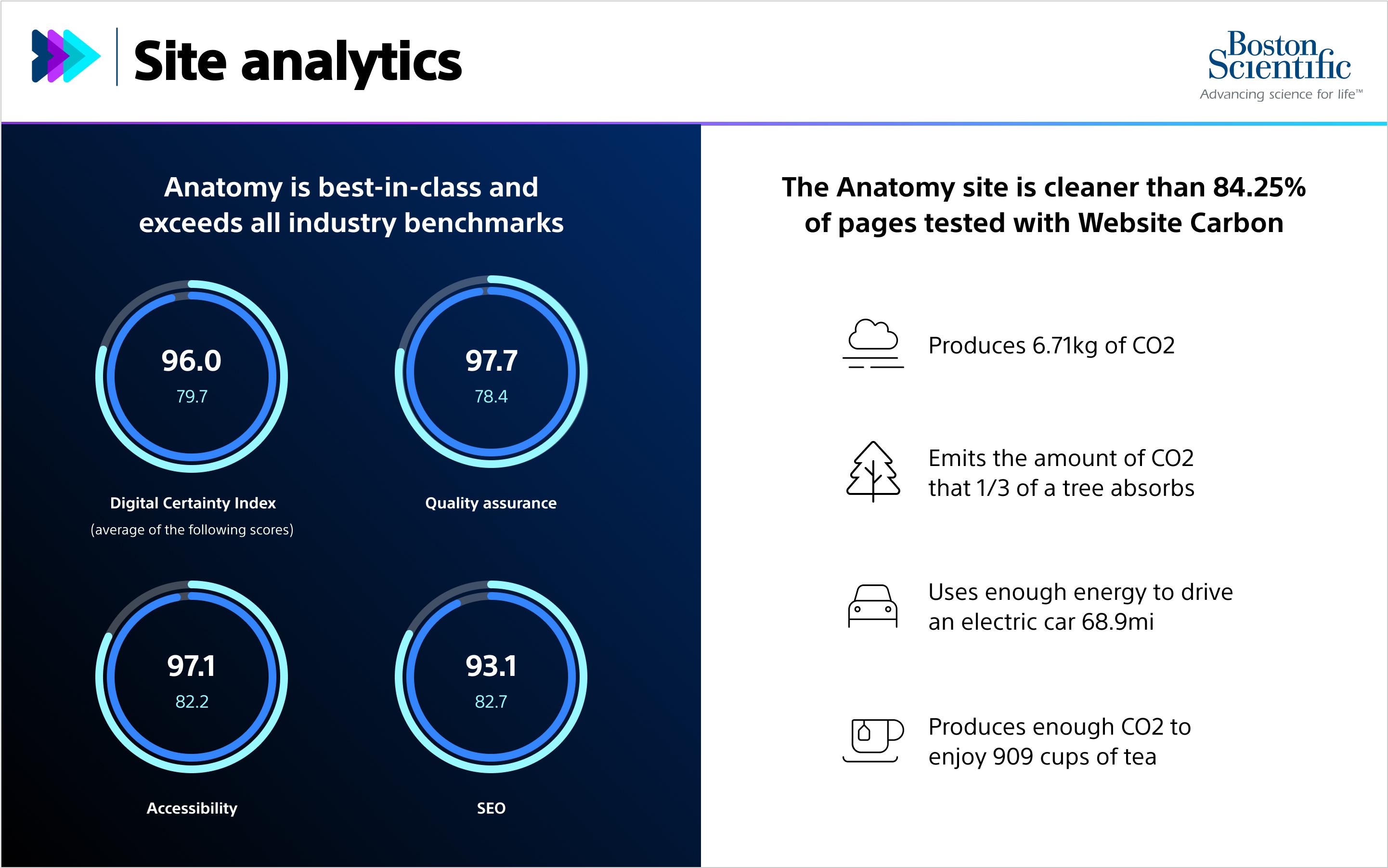
Anatomy generated an annual savings of $3.8M and increased design efficiency by 20-30%, development efficiency by 65%, and accessibility scores in downstream products by an average of 42%. The team consistently exceeded our goals and delivered impressive results, which earned us several awards for innovation and collaboration. We regularly received positive feedback from the community.
Anatomy is a dream to work with, and it is honestly impressive that y’all are maintaining such a sophisticated design system. We really don’t see that every day.
— Brendan Binger, Quarry
More companies ought to invest in content and design guidelines like the ones you all made, they’re so helpful.
— Nathaniel Weir, ThinkParallax