Overview
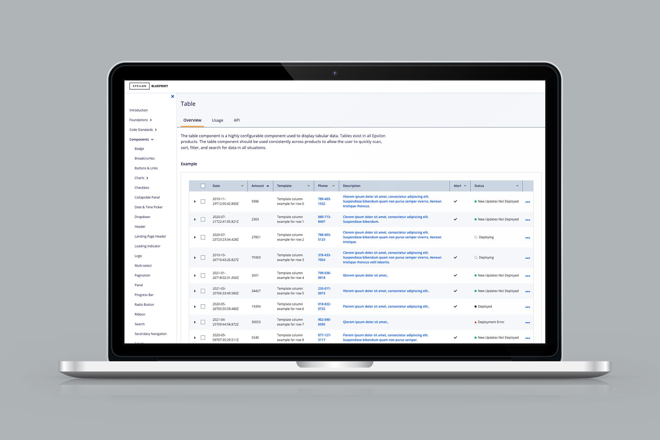
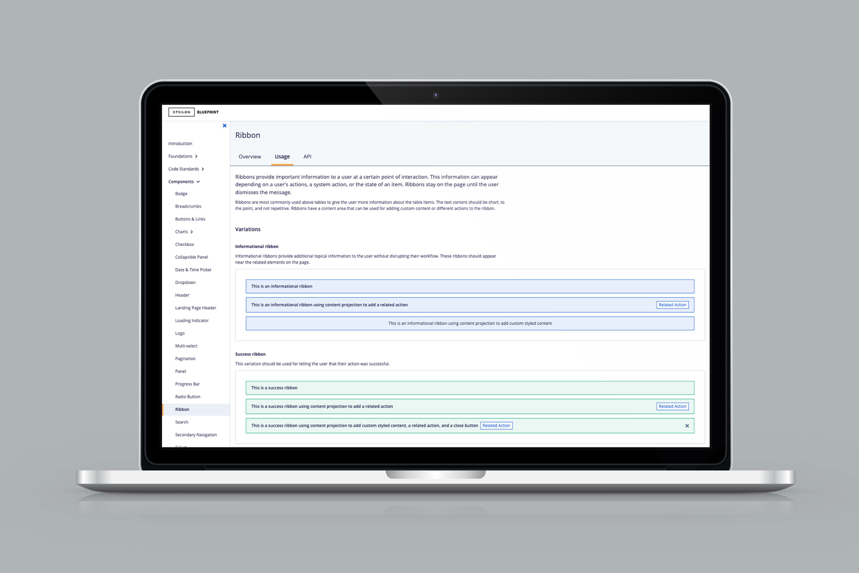
Blueprint is Epsilon’s first design system and component library. The system needed to create consistency across the PeopleCloud product suite and accelerate delivery for product teams.
Created with: HTML, CSS, Sass, Less, Angular, TypeScript, React, jQuery, Razor
Background
Epsilon is a global data-driven advertising and marketing technology company. Clients include the world’s top brands, agencies, and publishers across industries such as auto, retail, hospitality, financial services, and more.
- 8,000 employees worldwide
- $1.7 billion annual revenue
- 250 million verified U.S. consumers
- 6 award-winning products
Team and role
I was the first developer to join the Product User Experience Team, made up of one UX manager and two UX designers. Over time, the team grew to include another UX developer, two UX developer interns, and one UX design intern.
I worked on building the Blueprint component library and its documentation website from the ground up. I also worked across the PeopleCloud product suite to bridge the gap between UX and engineering.
(Re)design
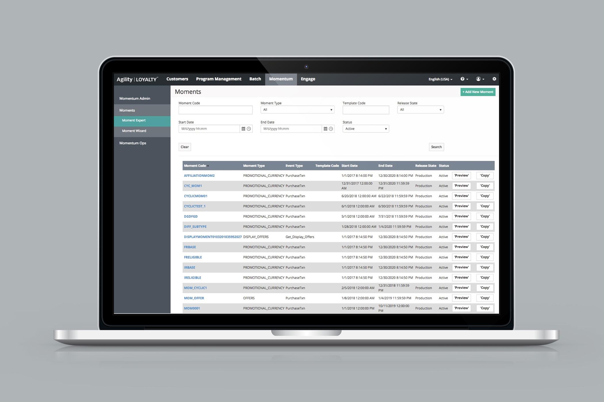
When I joined the team, the designers were working on a product suite redesign. We identified components that were inconsistent across products – such as buttons, links, form controls, tables – and began to standardize them. I participated in design reviews, sharing feedback and proposing ideas, and the designers created a style guide in Sketch.
It was a great time to join because it gave me visibility into the pain points across the product suite and a voice in the solutions. The products were not responsive or accessible, so I advocated to include addressing those pain points in the scope of the redesign.
Discovery
Blueprint was a “side of desk” project with no official support or buy-in. It was critical that adopting Blueprint would not be disruptive to product teams and that it would help them accelerate delivery. With this in mind, I conducted a tech stack assessment across the product suite. There was a mix of technologies in use, but the majority of the newer products were using Angular. This made Angular the clear choice for our component library and documentation site.
Many products also had deprecated dependencies, multiple CSS frameworks, and even multiple versions of the same CSS framework installed. I created a new product setup guide that included a recommended product architecture and outlined what JavaScript framework, CSS preprocessor, linters, and dependencies to install. I met with leadership to share my recommendation, and it became the standard for all new products.

From concept to production, navigating trade-offs
I began building the component library and documentation site, working closely with designers throughout the process. I quickly realized I had limited capacity and needed to deliver a large project. The products were already using third-party libraries, so I decided to continue leveraging third-party libraries for a few of the more complex components like selects and date pickers until we had support, buy-in, and more resources. I ensured the third-party libraries were open source, lightweight, accessible, and built using TypeScript. And I worked with designers to adapt component designs into custom themes for the third-party solutions.
In just six months, we built and shipped the first major version of our component library and documentation site using GitHub, npm, and Netlify.
Scaling the team
As we delivered value and demand increased, we got approval to open roles. I created a hiring process, and used it to interview and assess candidates for my team as well as product teams. My team grew to include a junior developer and two interns, one of whom joined the team as a full-time employee after graduating. I led and mentored three UX developers, and mentored developers across our seven product teams.
I wrote code standards, documented our definition of done, established code review practices, and encouraged pair programming. I also curated training resources and hosted a quarterly webinar series to elevate organizational knowledge. This helped us set a high bar for front-end code while reducing demand on our team.
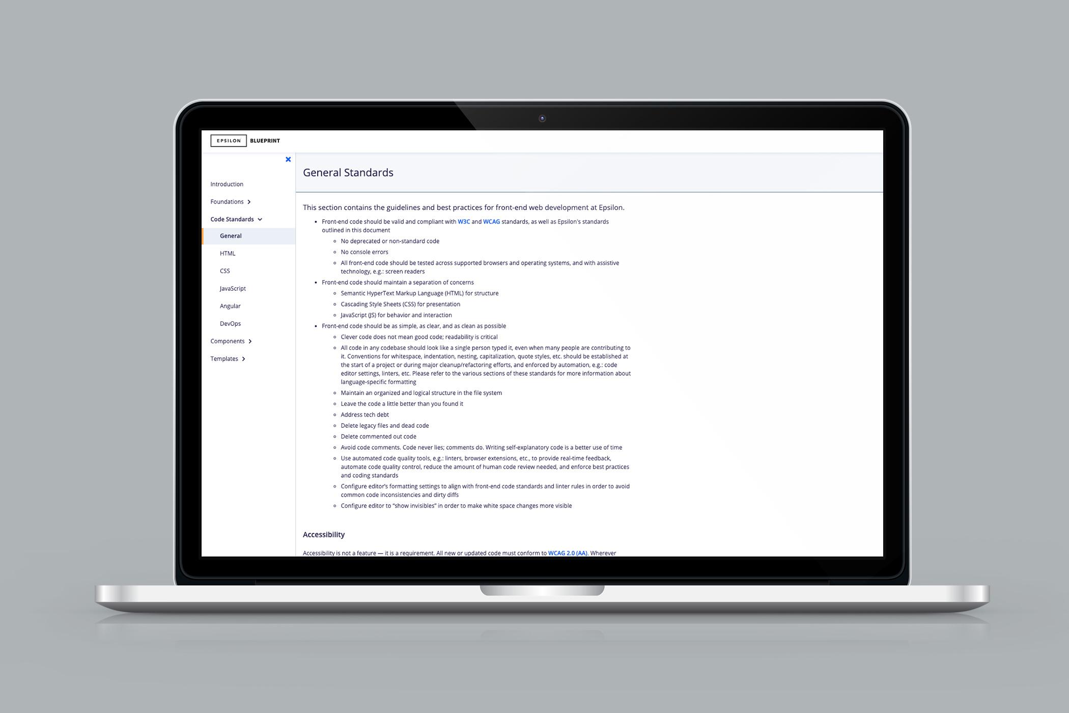
PeopleCloud product suite
While my primary responsibility was to build and maintain Blueprint, I also leaned out to support our product teams. I contributed code to, and reviewed code going into, every codebase in our award-winning SaaS product suite. I assisted product teams with implementation of the redesign, installation and adoption of Blueprint, application of best practices, and feature development.
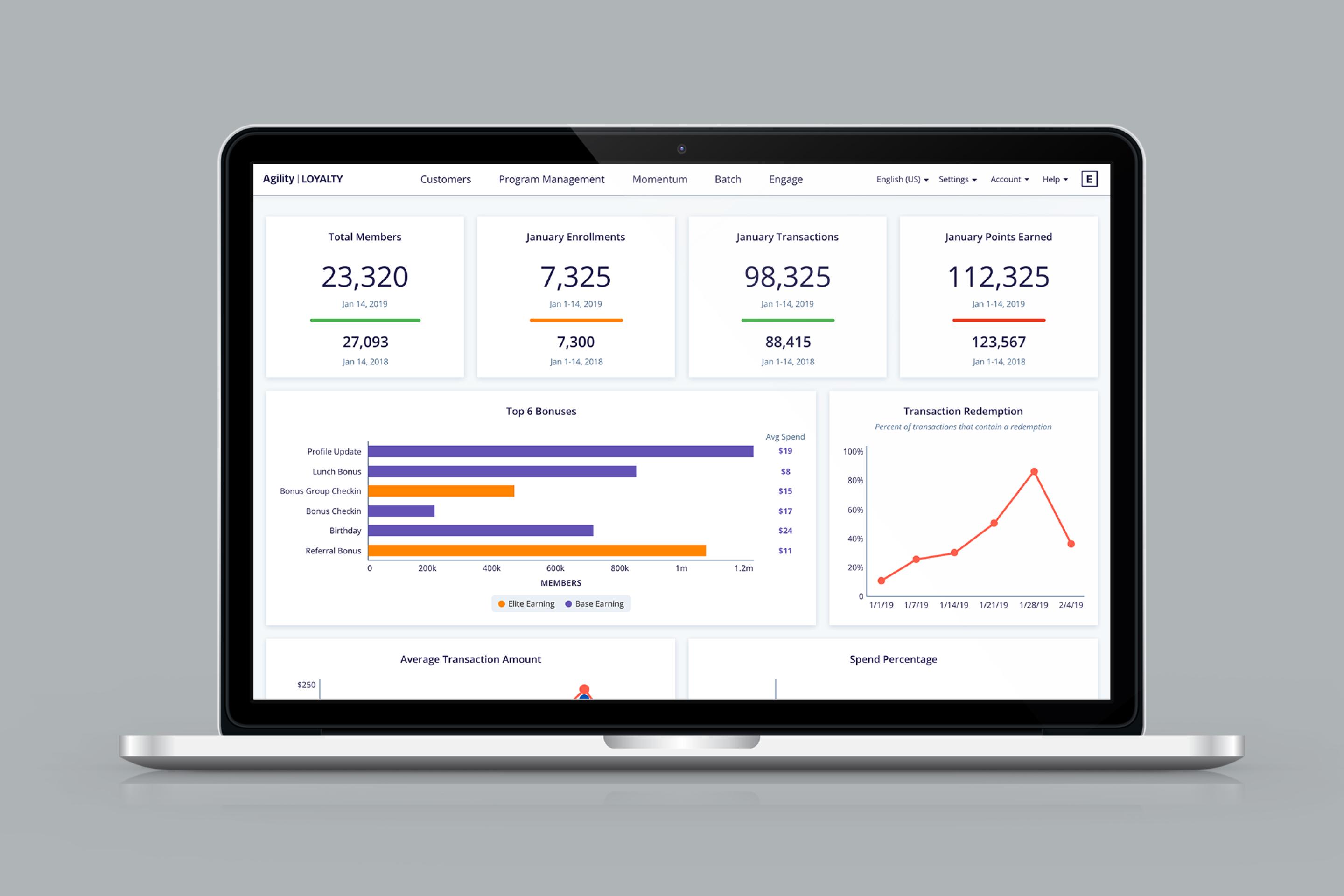
When accessibility became a requirement for our Loyalty product, the team reached out to me. I coached our design intern as she conducted an accessibility audit of the product, and flew to Texas to hold accessibility training sessions for the product team. I led the rebuild of the CSR screens. I refactored a legacy CSS file full of hundreds of ambiguously named classes and !important declarations while I was in there and turned 25,000+ lines of unwieldy CSS into 2,400 lines of maintainable CSS. I also developed dashboards for program and customer overviews.
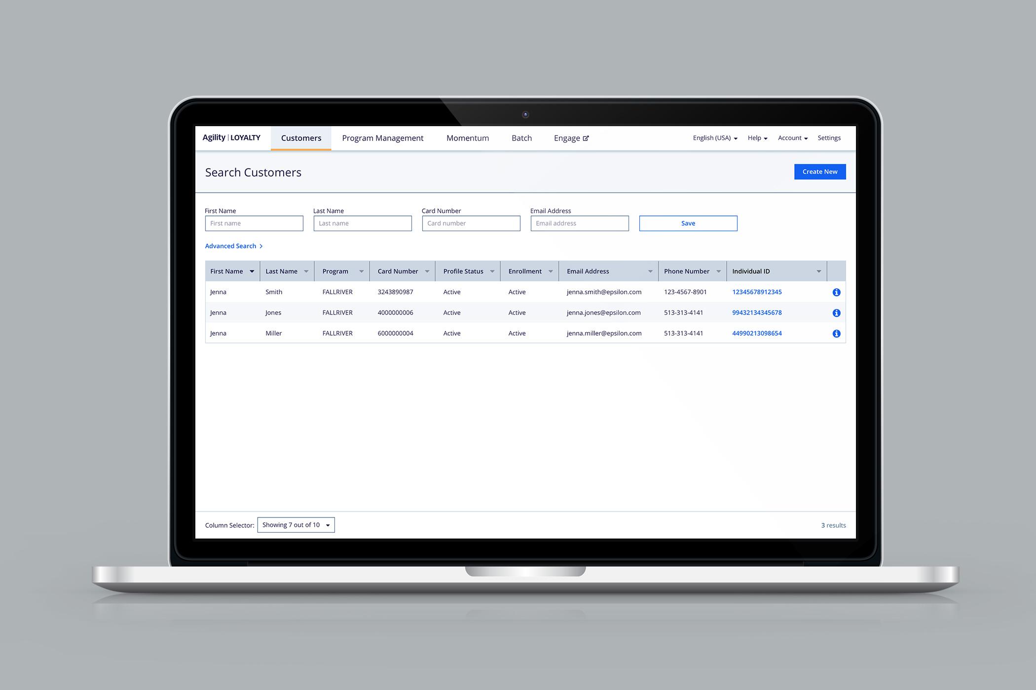
Impact and results
Blueprint was adopted in all of the PeopleCloud products. This resulted in: increased speed of product development, improved code quality, reduction of duplicative work, decreased maintenance costs, and consistent, accessible, responsive products.
